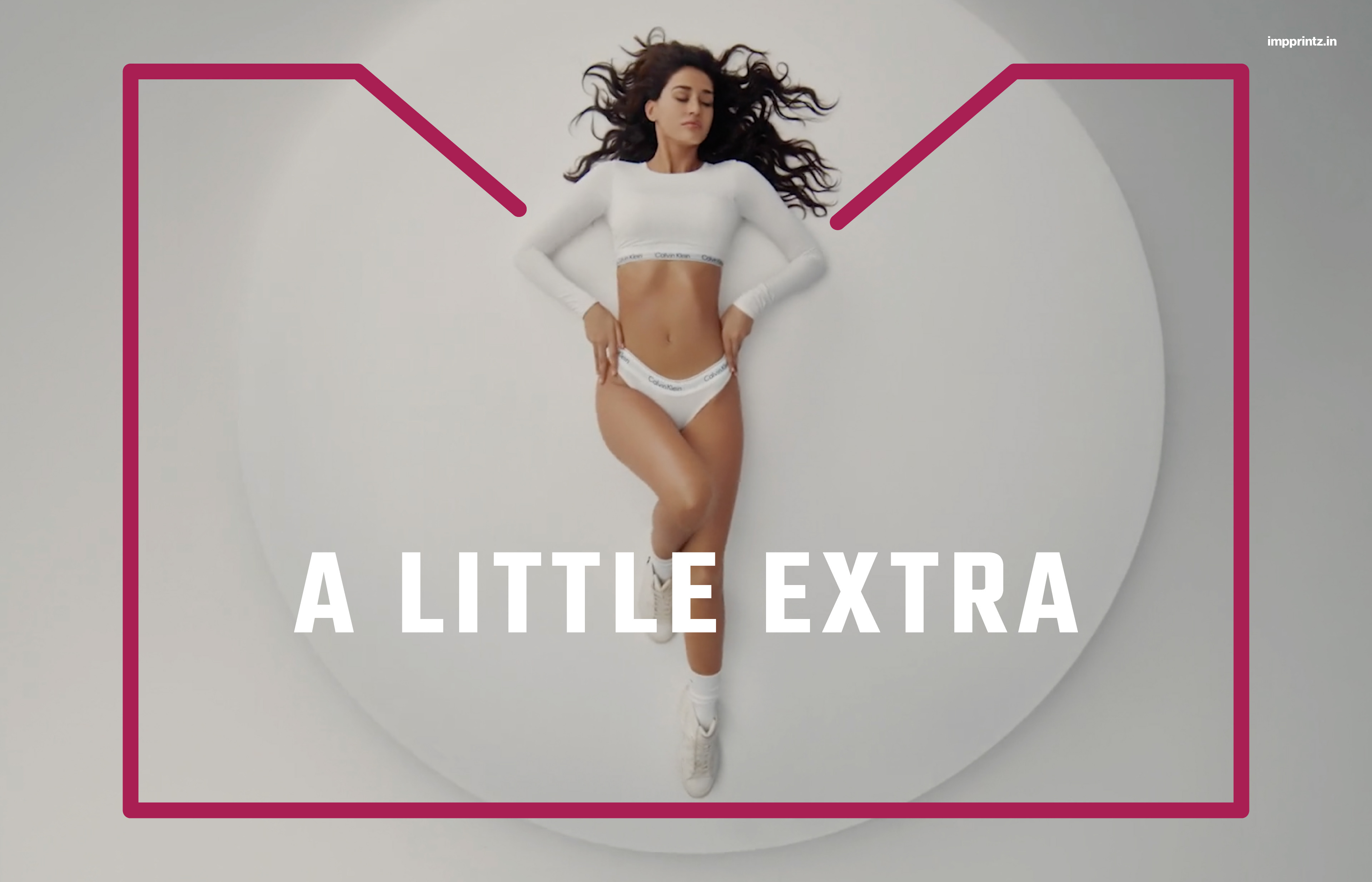
Un Poco Más Films is a full-service production house based in Mumbai. “You get what you asked for and a bit extra” - this is the heart and philosophy at Un Poco Más, a practice of doing a little more for their clients.
Unnati Agarwal, founder and executive producer, approached Impprintz to design a distinct identity for Un Poco Más Films. She wanted the design to be simple, clear, fun and somehow capture the idea of ‘a little extra’.
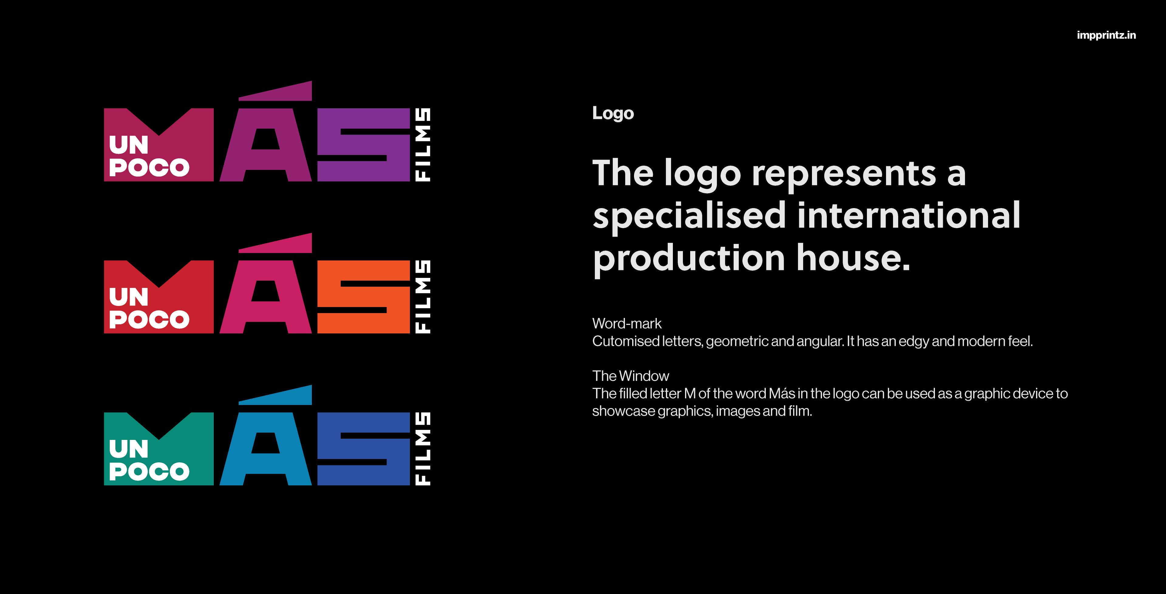
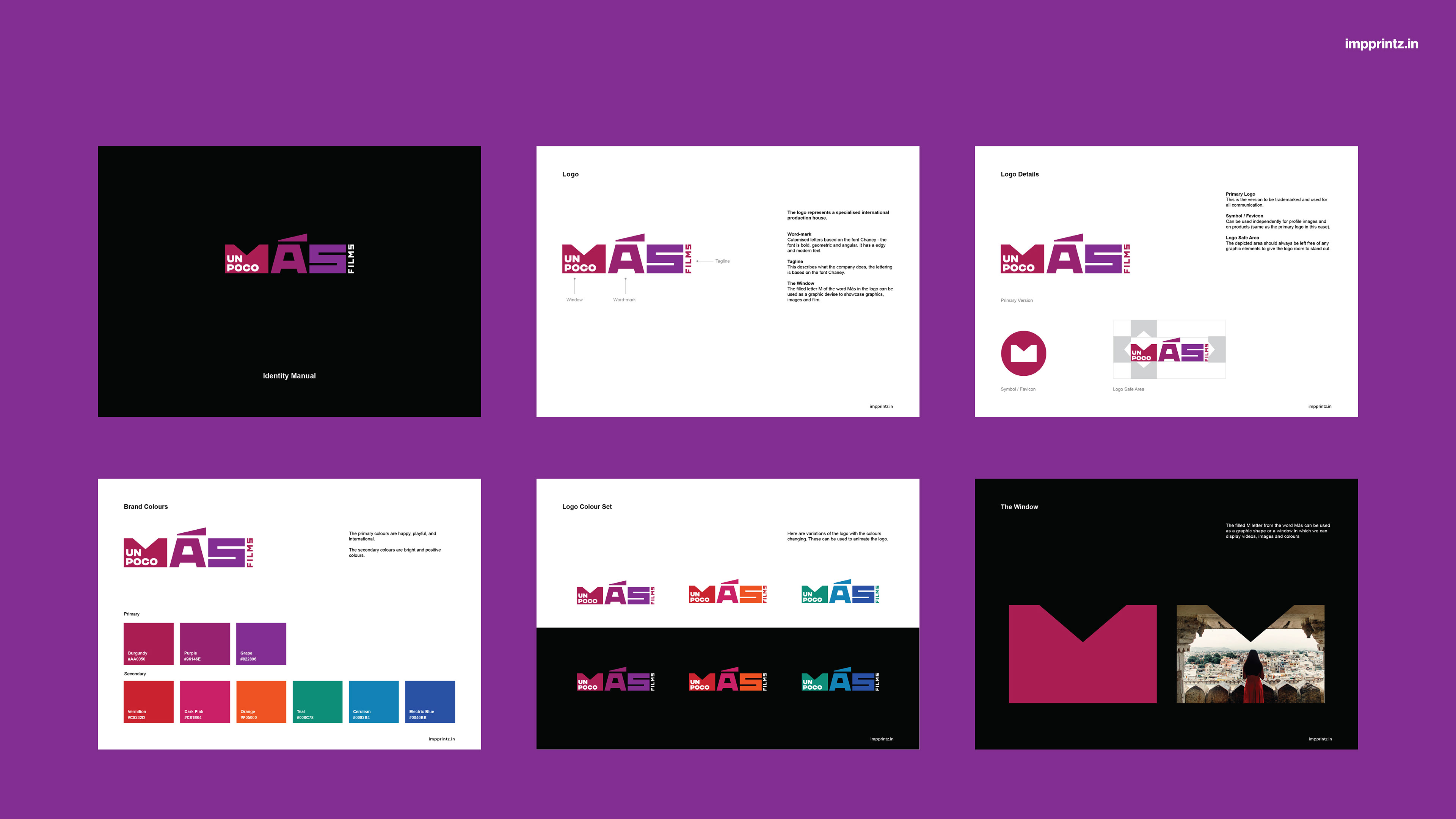
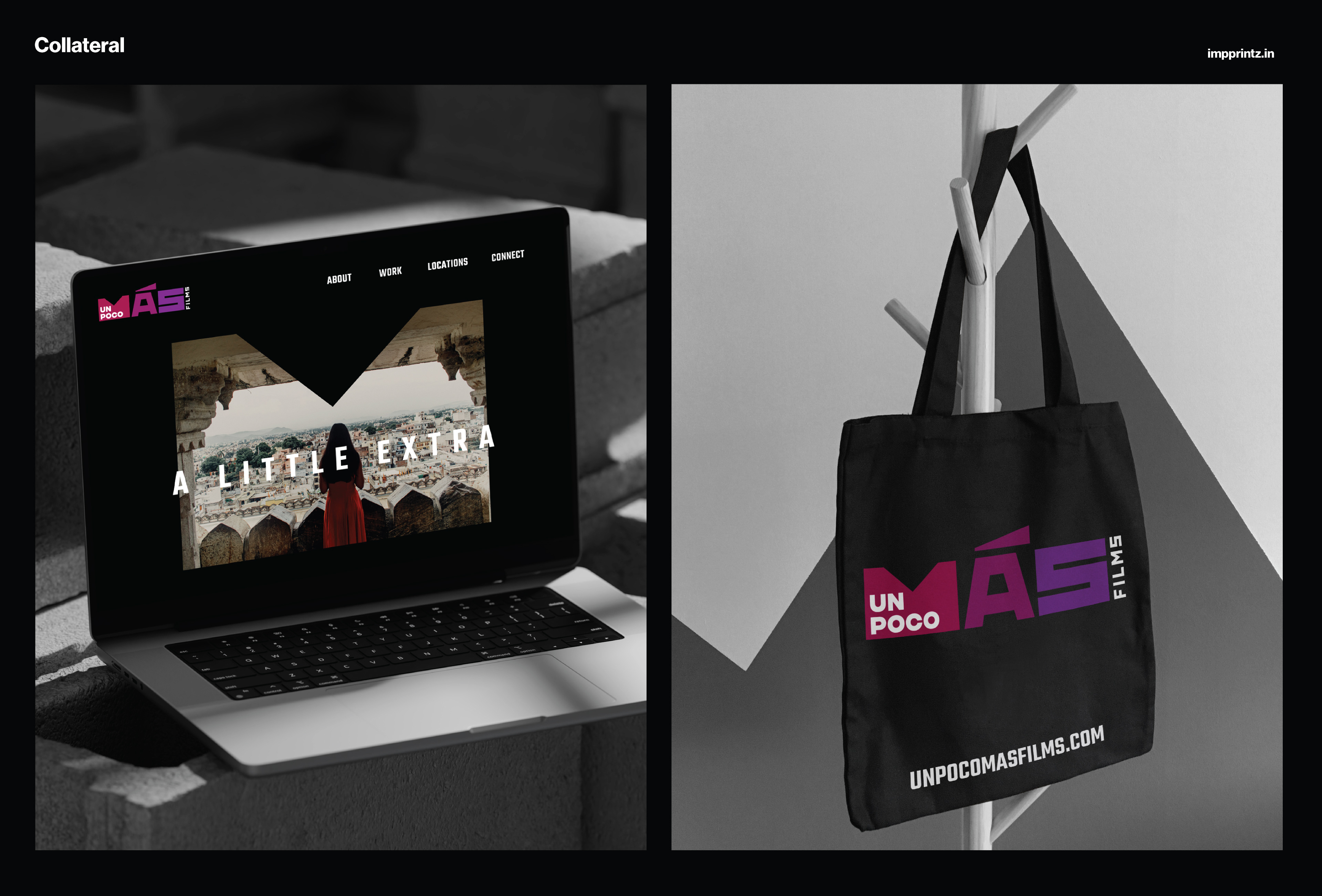
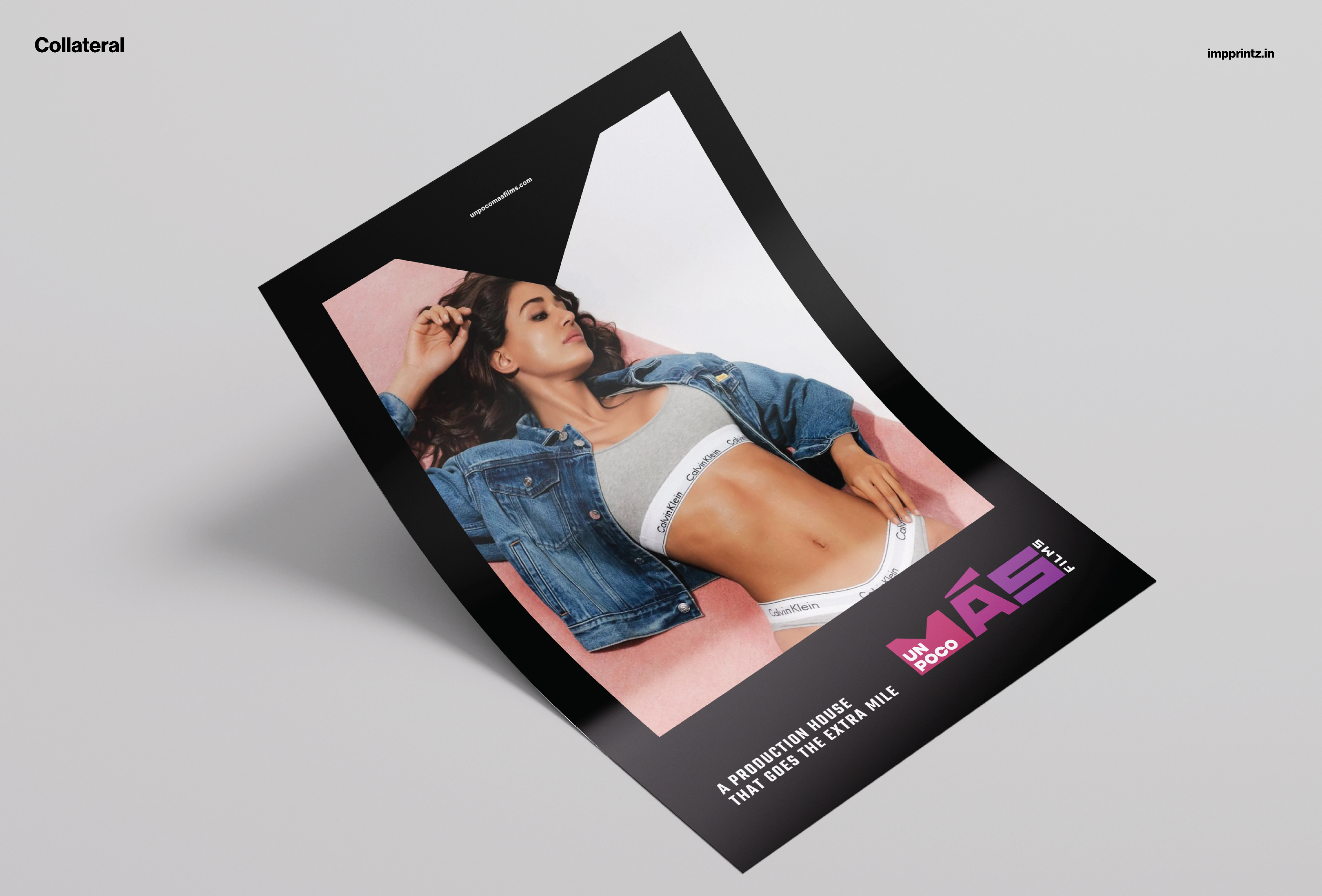
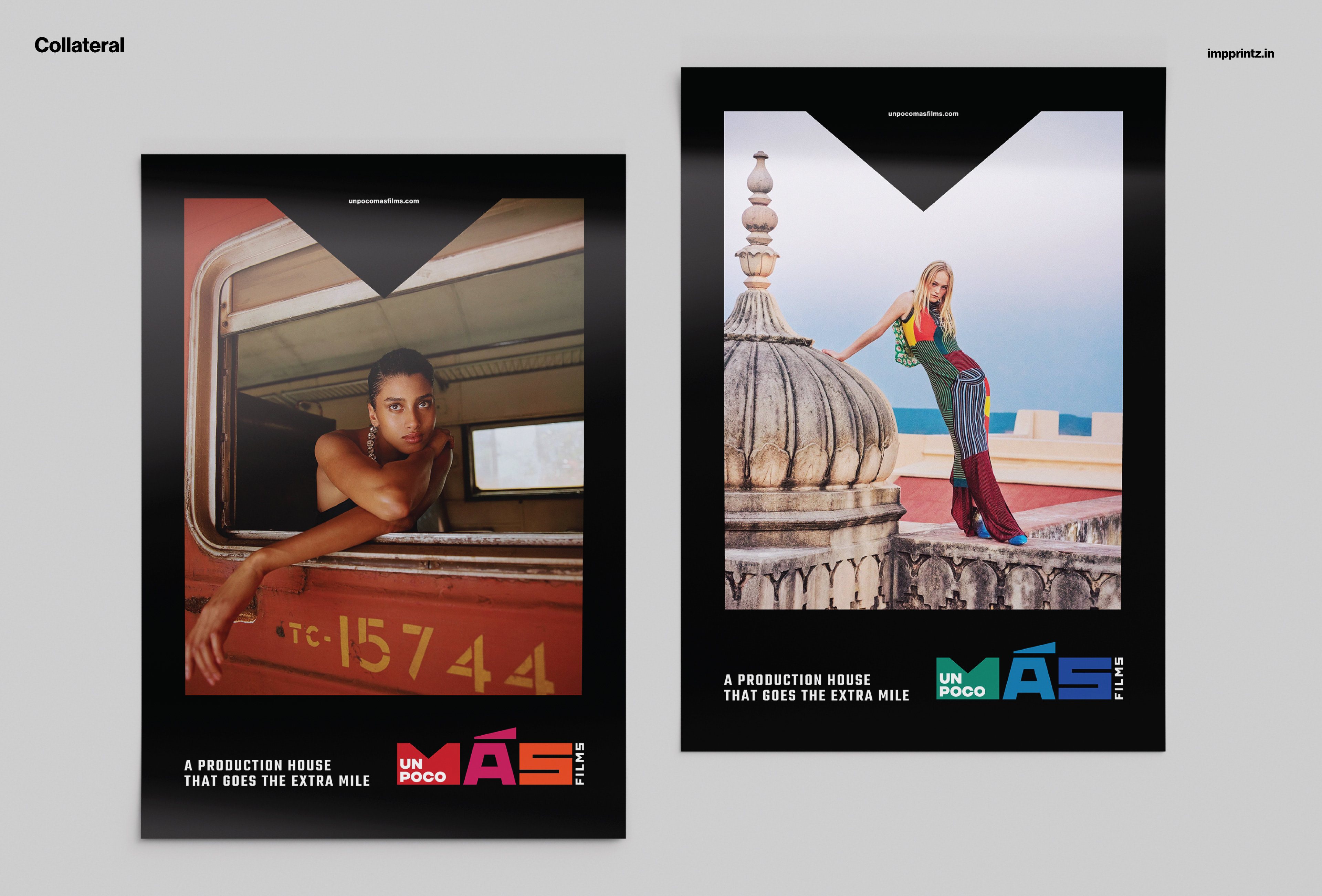
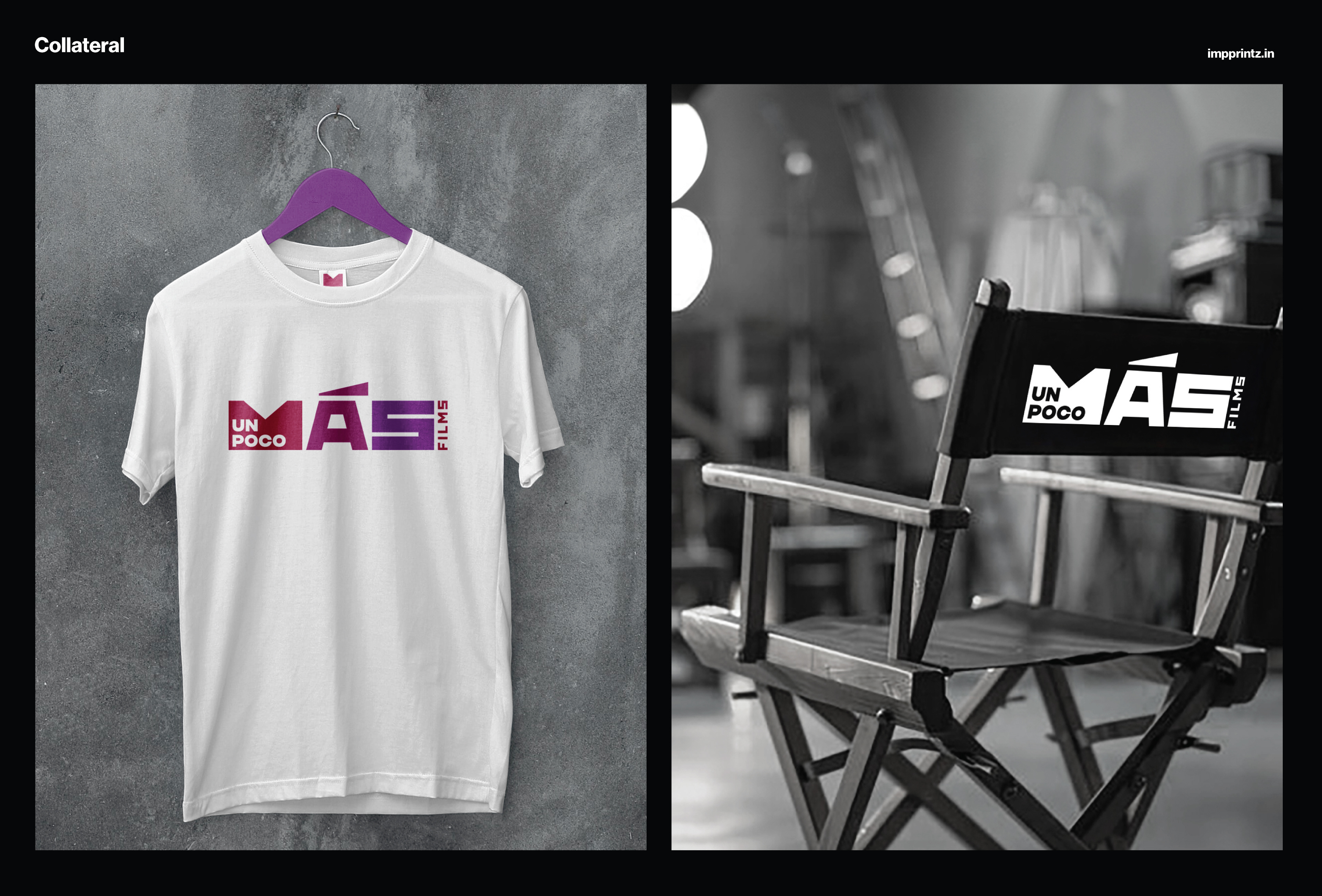
A geometric and edgy identity emerged through the design process. The name is set in a stylised way. ‘Un Poco’ uses a no fuss geometric font, nested within ‘M’ of the word 'Mas' - which means ‘more’ in Spanish. The ‘M’ is filled solid, breaking the typography and acts like a window, framing visuals and videos, creating a bespoke visual style across their communication. This piece captures the essence of ‘a bit more’ in the design.
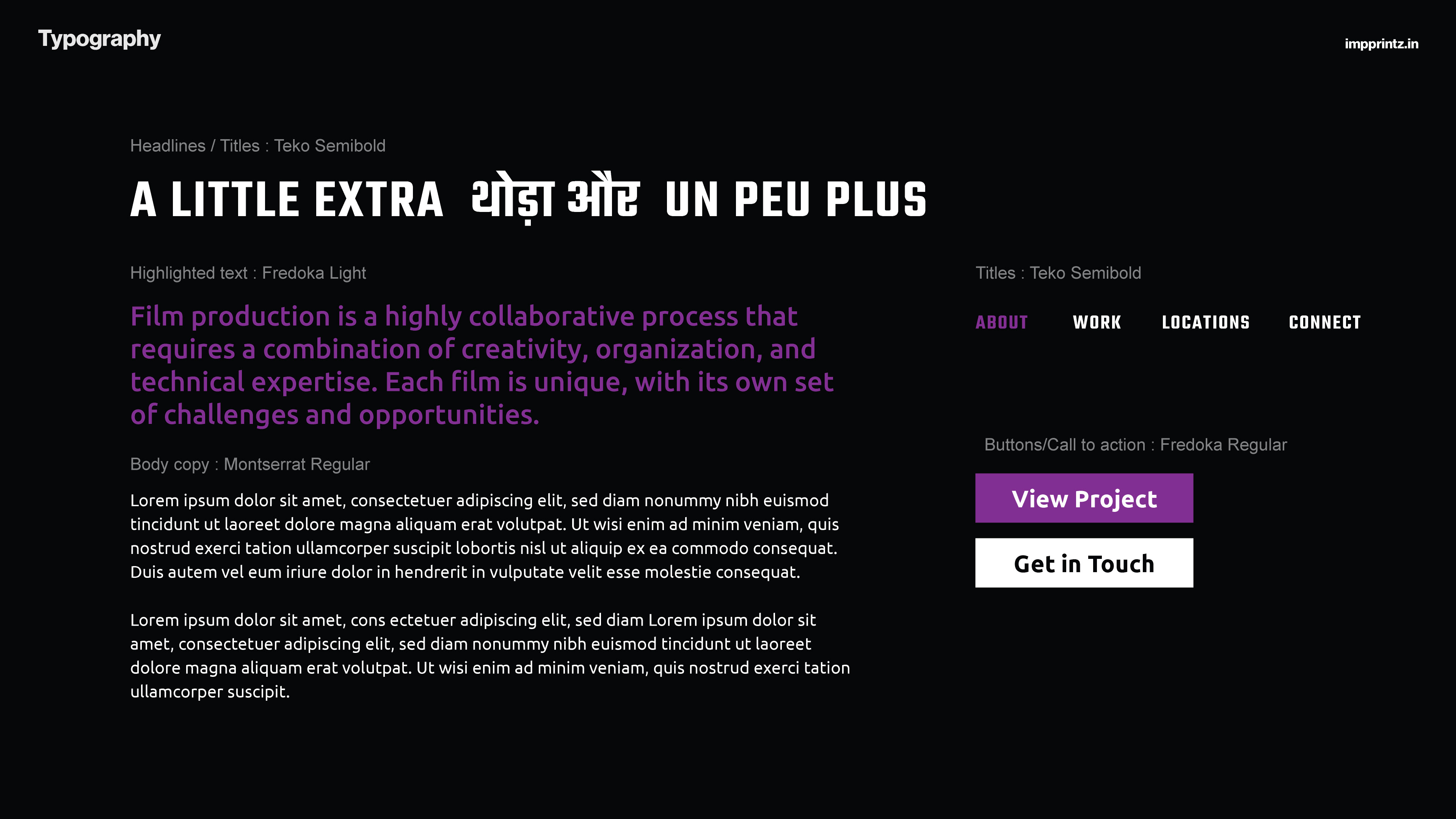
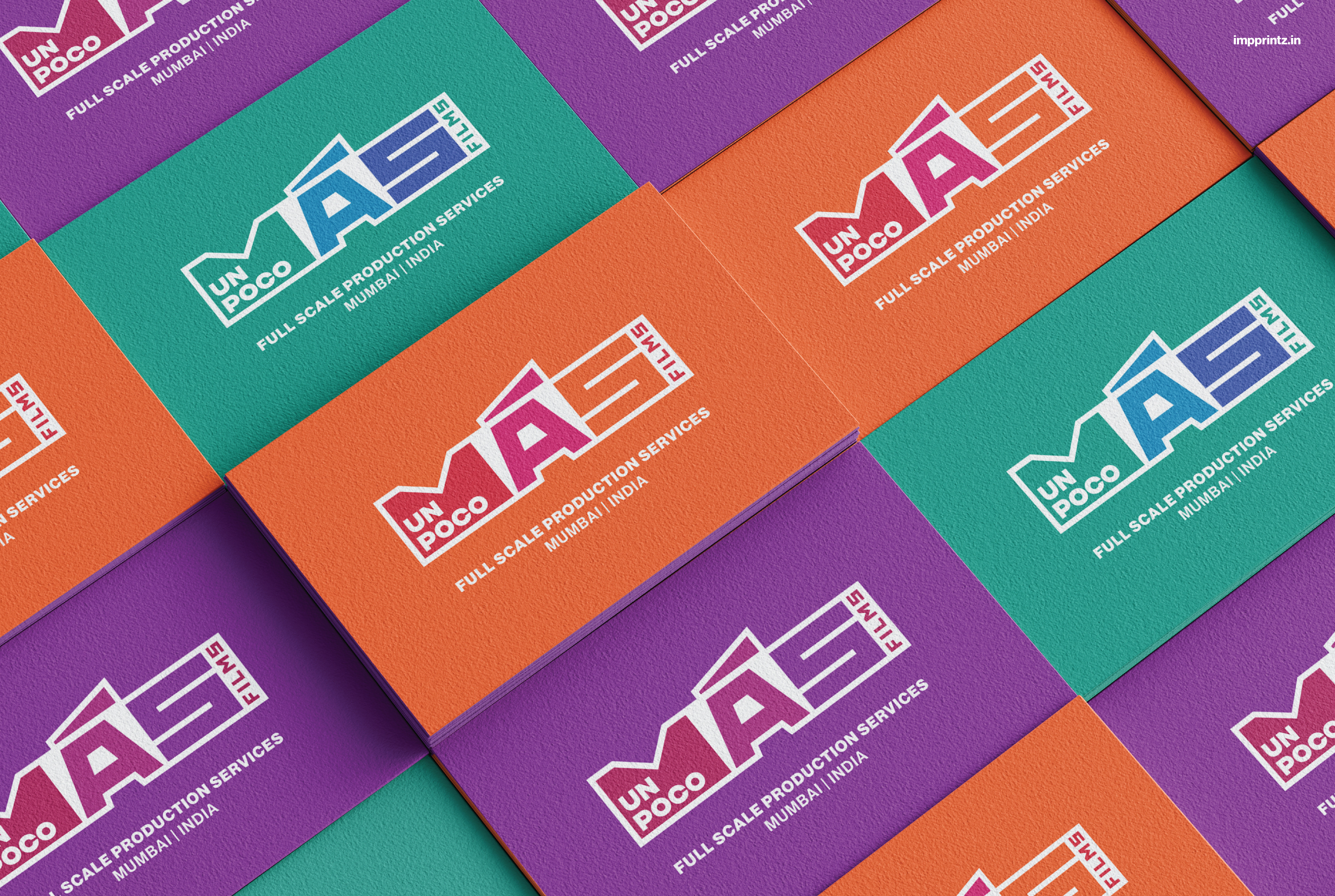
For ‘Mas’, a contrasting, bold, wide and angular font has been used. There is a play on the acute accent of A, it has been emphasised to resemble the light emitted in film projection. The colour palette is dynamic, cheerful, young and cosmopolitan, resonating with the spirit of Un Poco Más Films.
The identity is eye-catching, memorable and functional - at smaller sizes or in a single colour.
“Film making is to love what you create and to be a part of a collective journey of a film. The idea is to create with fun!” - Unnati
Unnati Agarwal, founder and executive producer, approached Impprintz to design a distinct identity for Un Poco Más Films. She wanted the design to be simple, clear, fun and somehow capture the idea of ‘a little extra’.
A geometric and edgy identity emerged through the design process. The name is set in a stylised way. ‘Un Poco’ uses a no fuss geometric font, nested within ‘M’ of the word 'Mas' - which means ‘more’ in Spanish. The ‘M’ is filled solid, breaking the typography and acts like a window, framing visuals and videos, creating a bespoke visual style across their communication. This piece captures the essence of ‘a bit more’ in the design.
For ‘Mas’, a contrasting, bold, wide and angular font has been used. There is a play on the acute accent of A, it has been emphasised to resemble the light emitted in film projection. The colour palette is dynamic, cheerful, young and cosmopolitan, resonating with the spirit of Un Poco Más Films.
The identity is eye-catching, memorable and functional - at smaller sizes or in a single colour.
“Film making is to love what you create and to be a part of a collective journey of a film. The idea is to create with fun!” - Unnati
You can view their work on unpocomasfilms.com