A food startup with the goal of creating everyday clean-label products for children and adults approached Impprintz. They needed a unique and catchy name, a distinctive brand identity, and a simplified packaging design for their range of healthy snack alternatives.
The name needed to be simple enough for children to remember and pronounce, yet appealing to adults. And so Hullo was born—fun and memorable for all. It’s a play on the word “hello”, a word used to greet, get attention, or express surprise; friendly, open, and universal in its appeal.
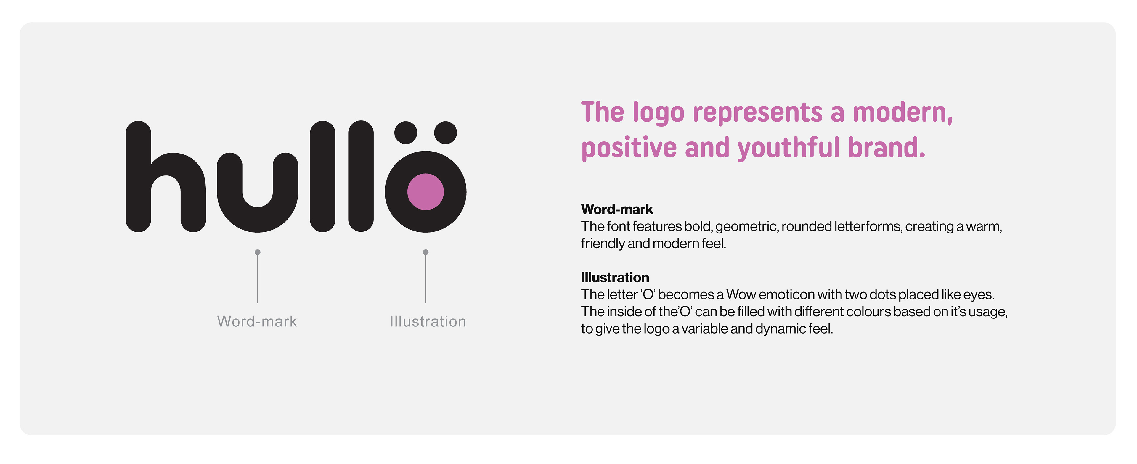
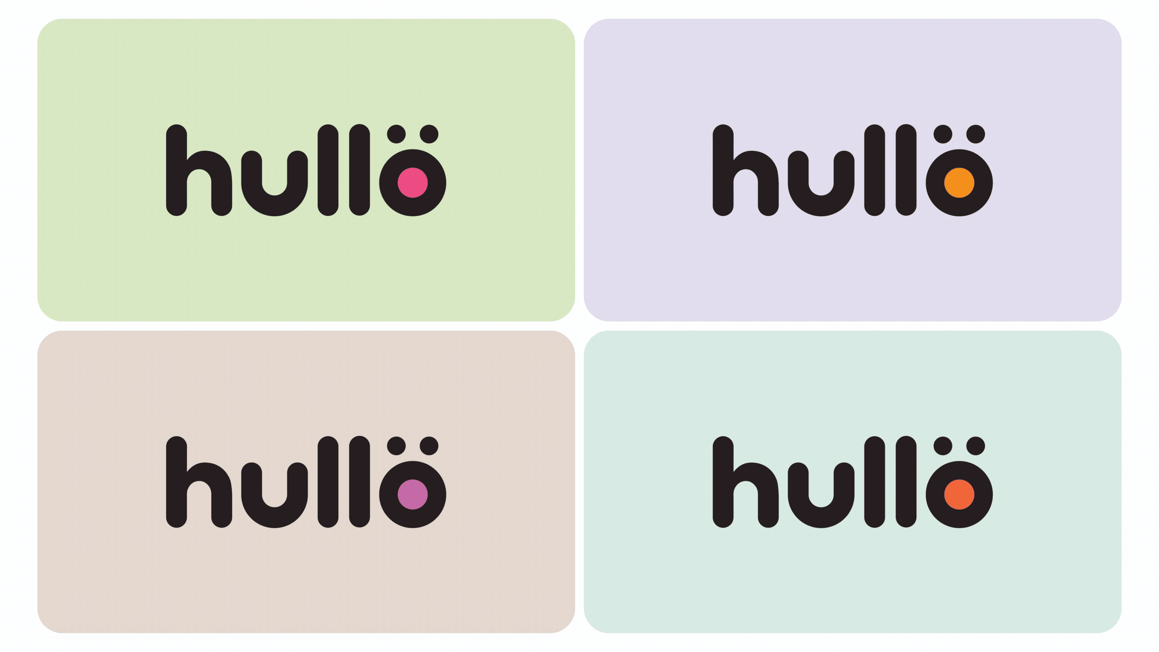
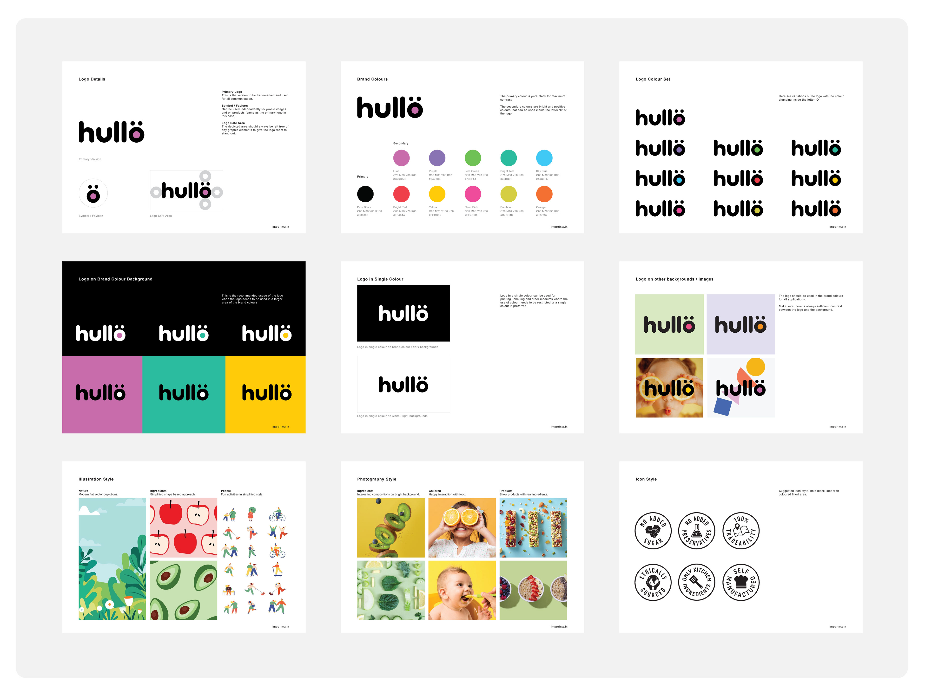
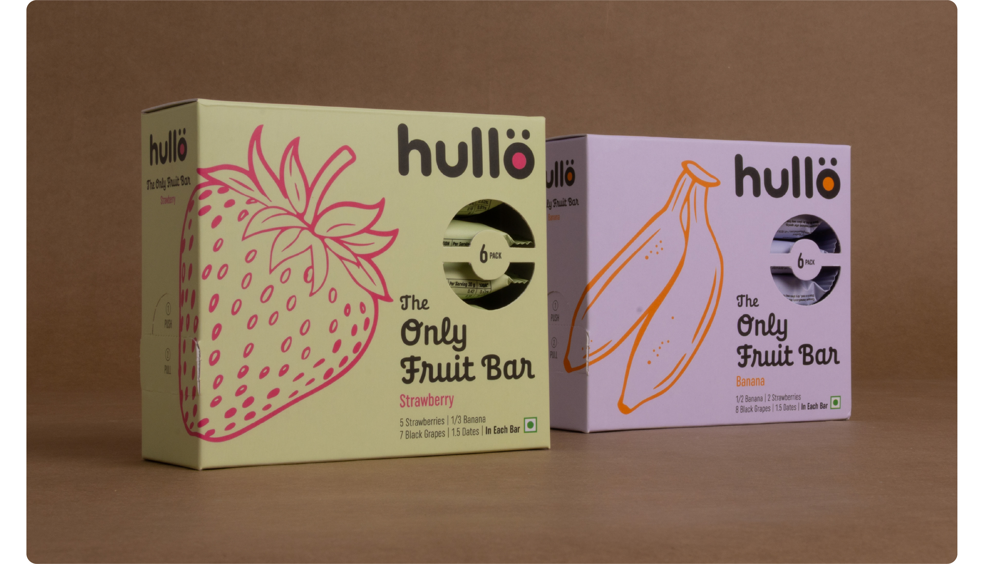
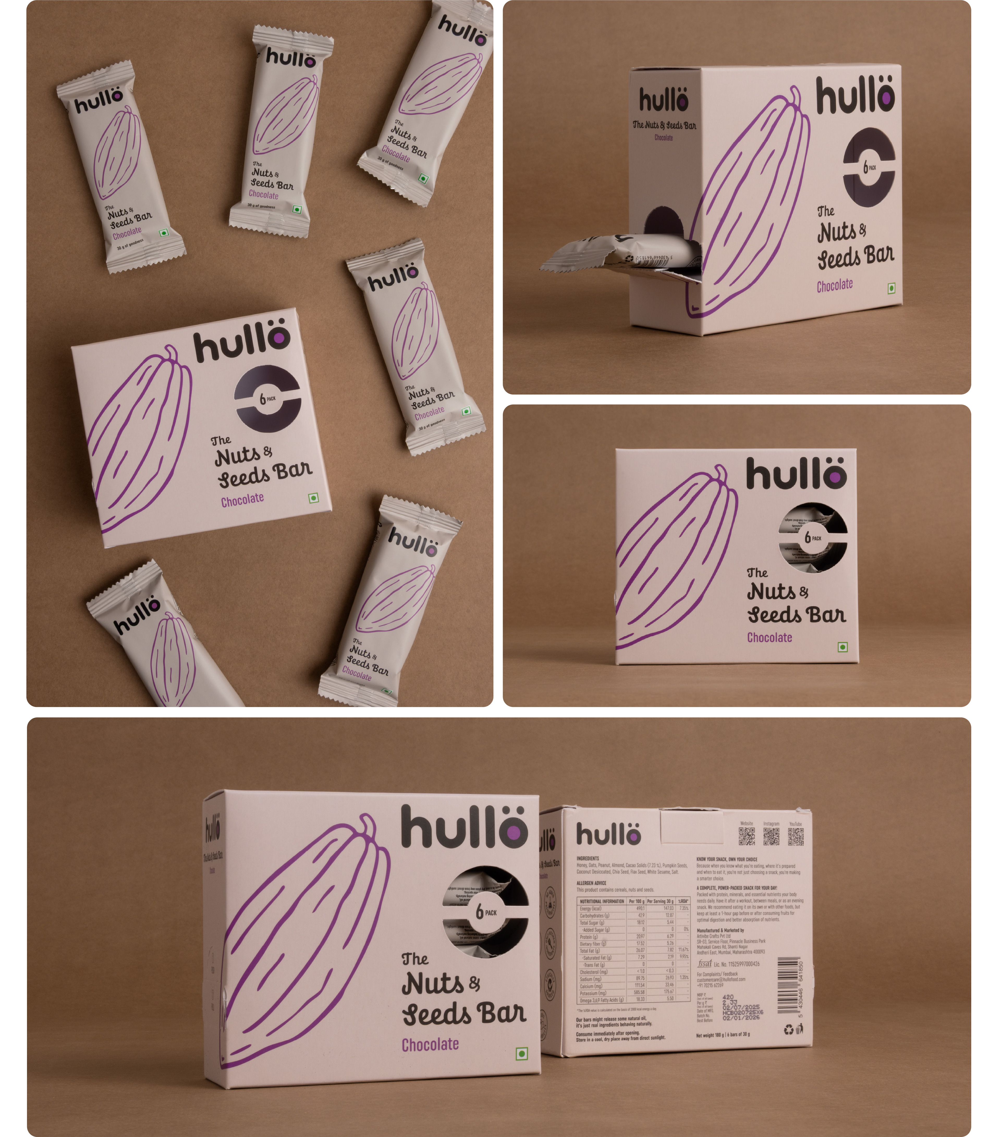
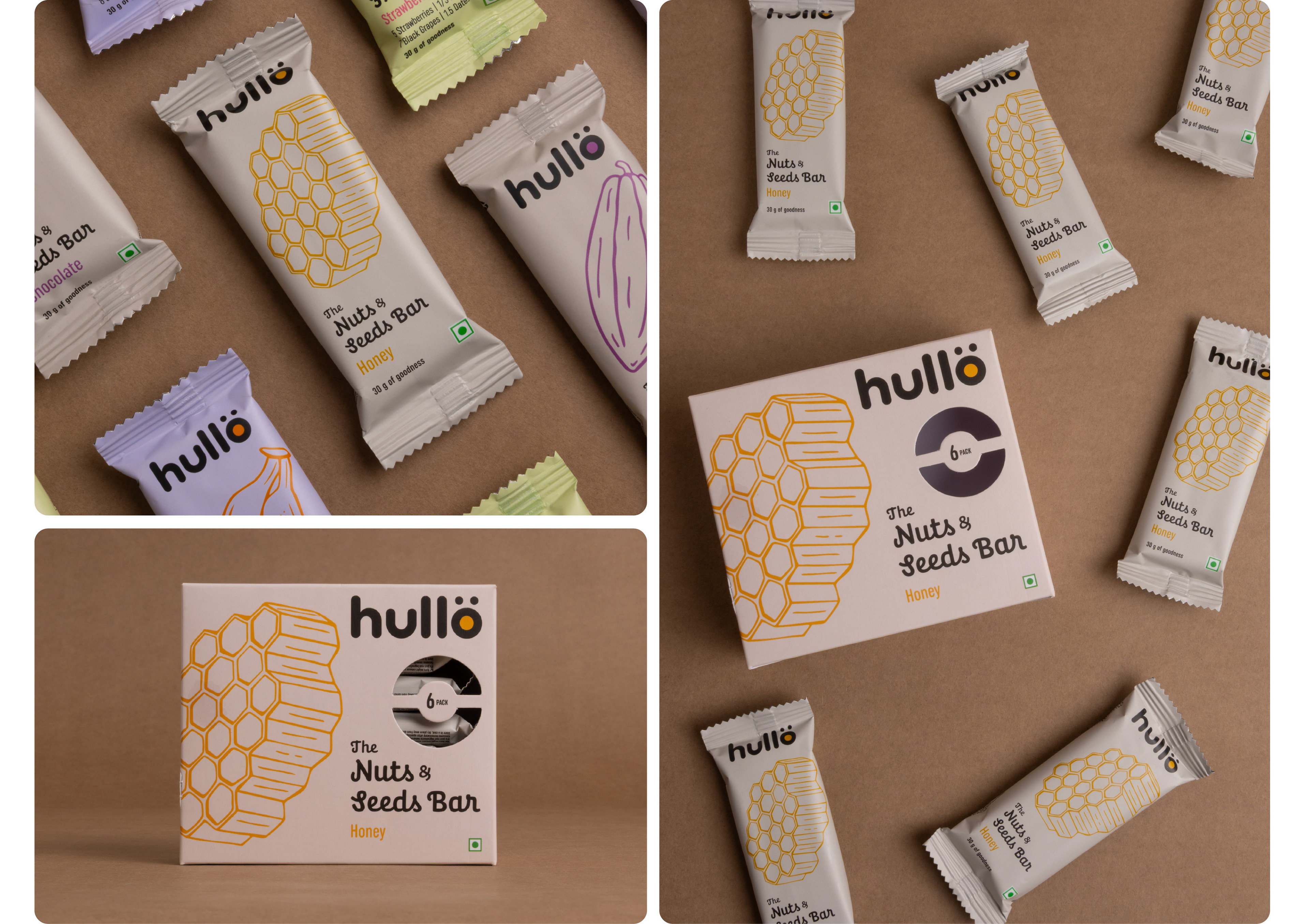
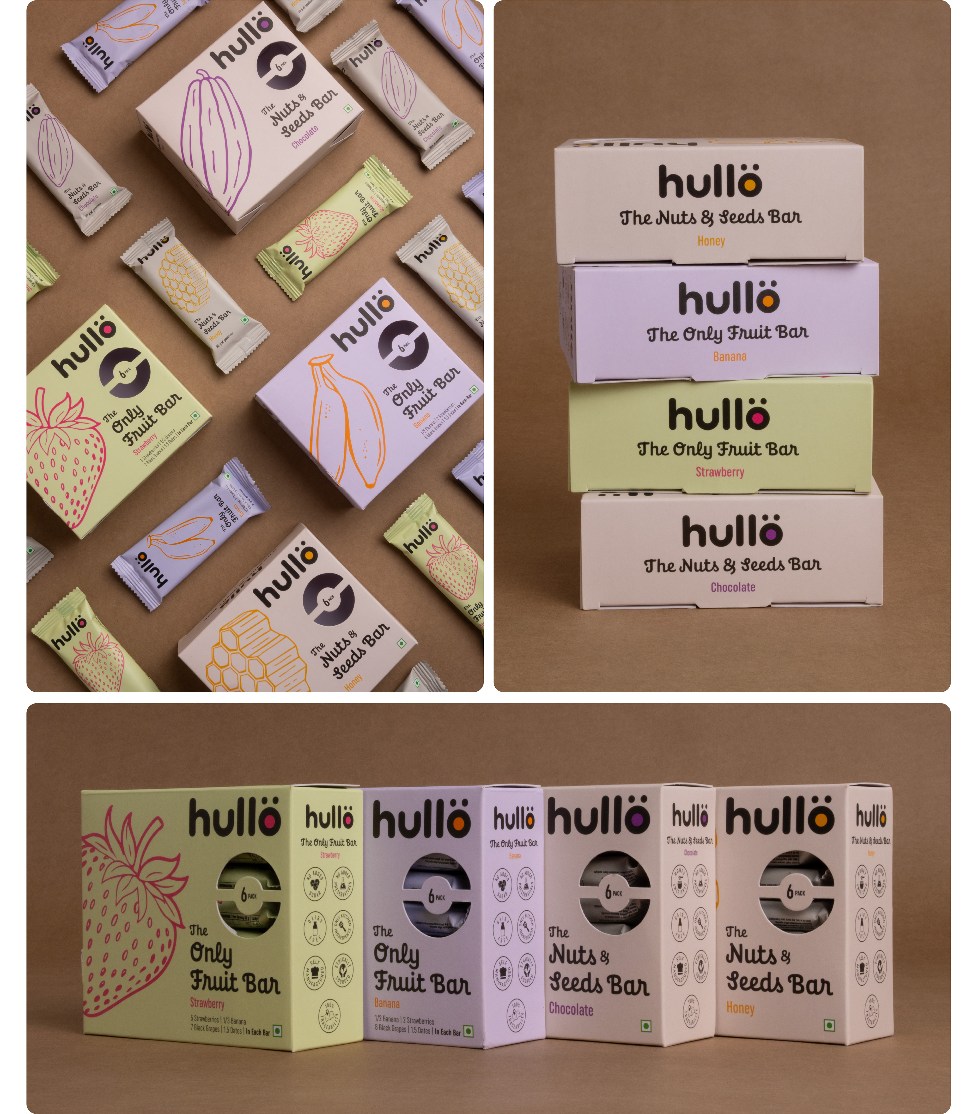
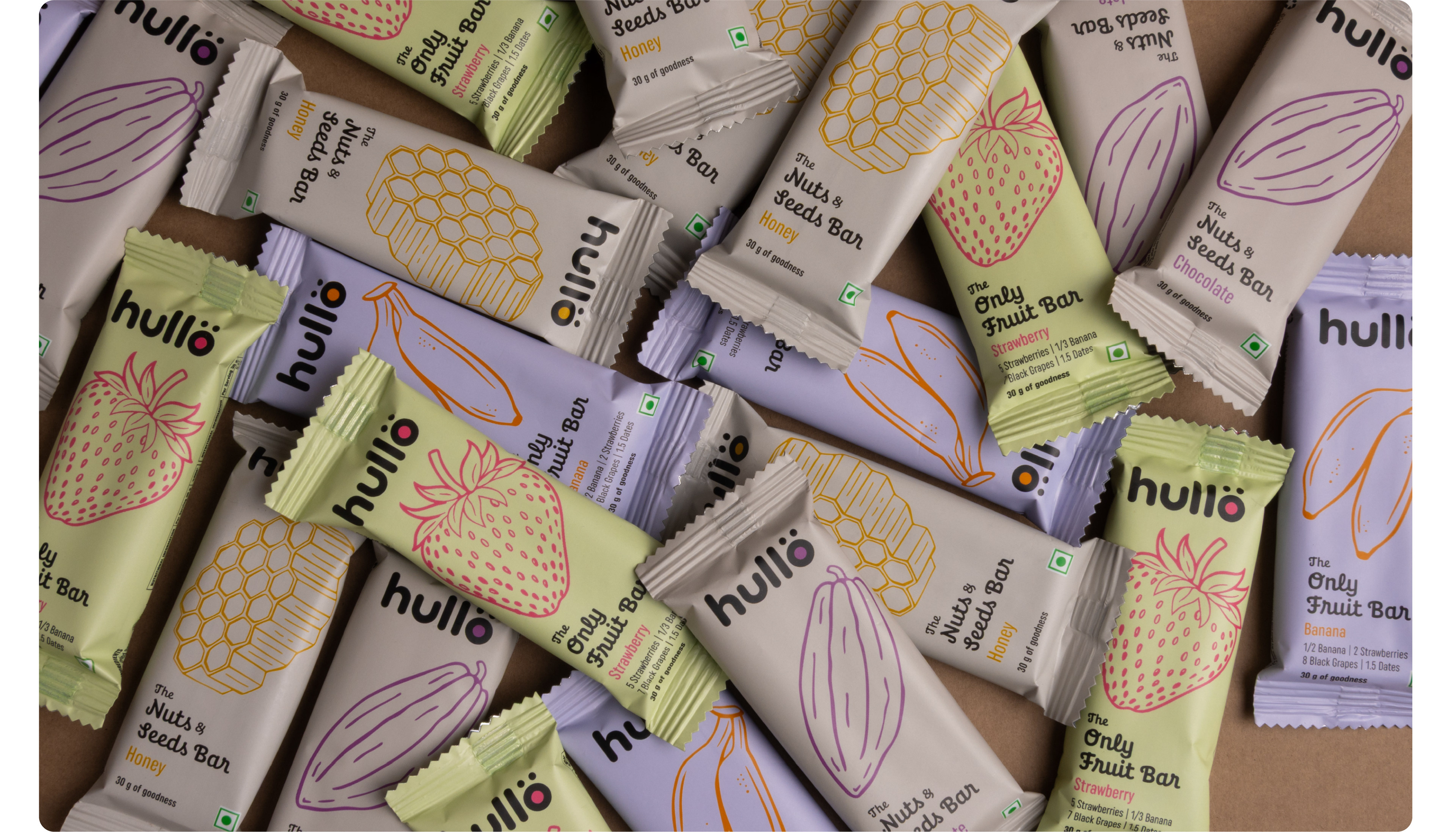
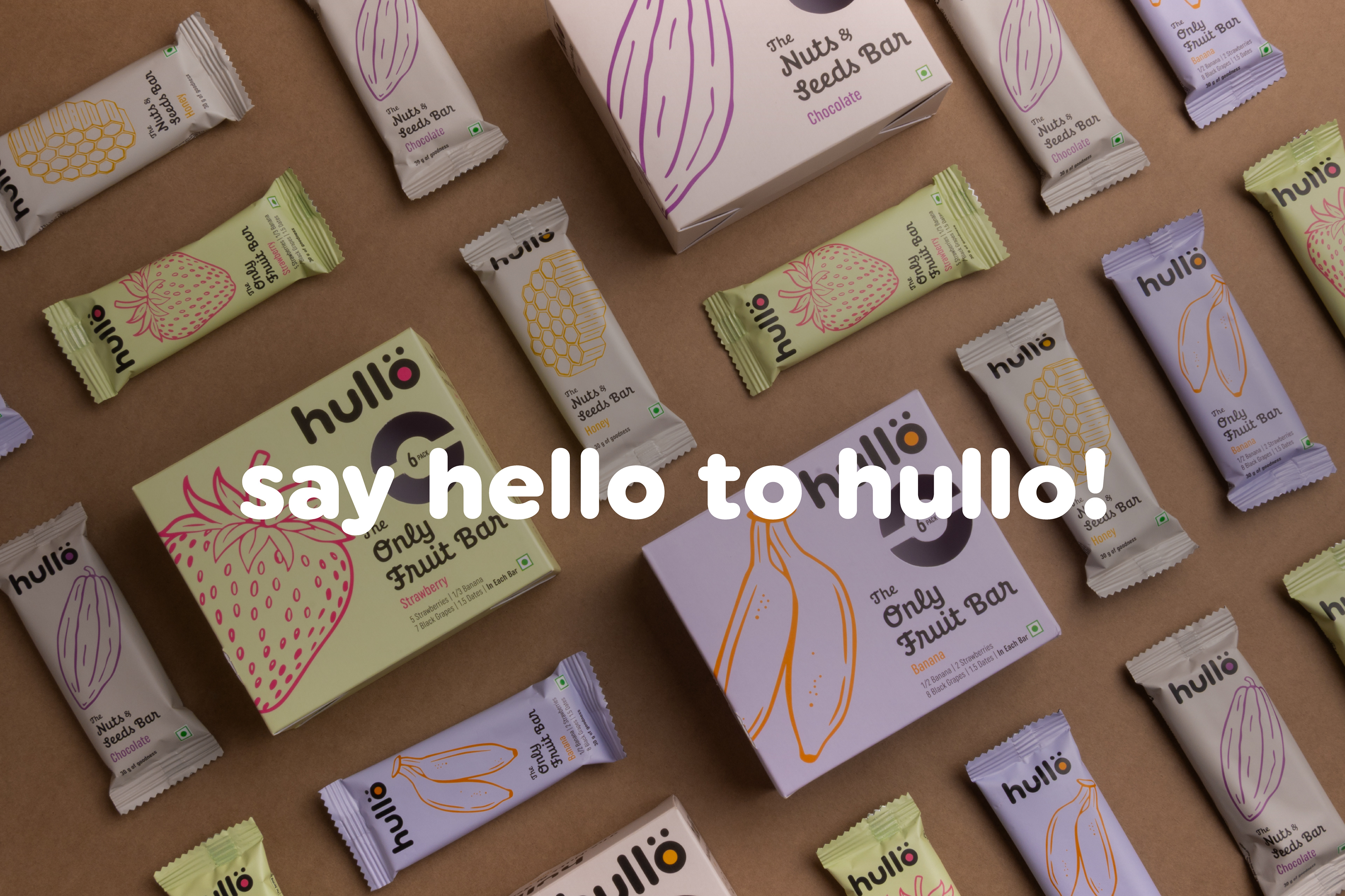
The identity was designed to resonate with a broad audience, from toddlers to adults. It has a clean, friendly, and modern feel, while staying neutral, bold, and wholesome. The letter “O” transforms into a wow emoticon, with two dots placed like eyes, adding an emotive quality to the logotype. The inside of the “O” can be filled with different colours based on its usage, giving the logo a playful, flexible, and dynamic character.
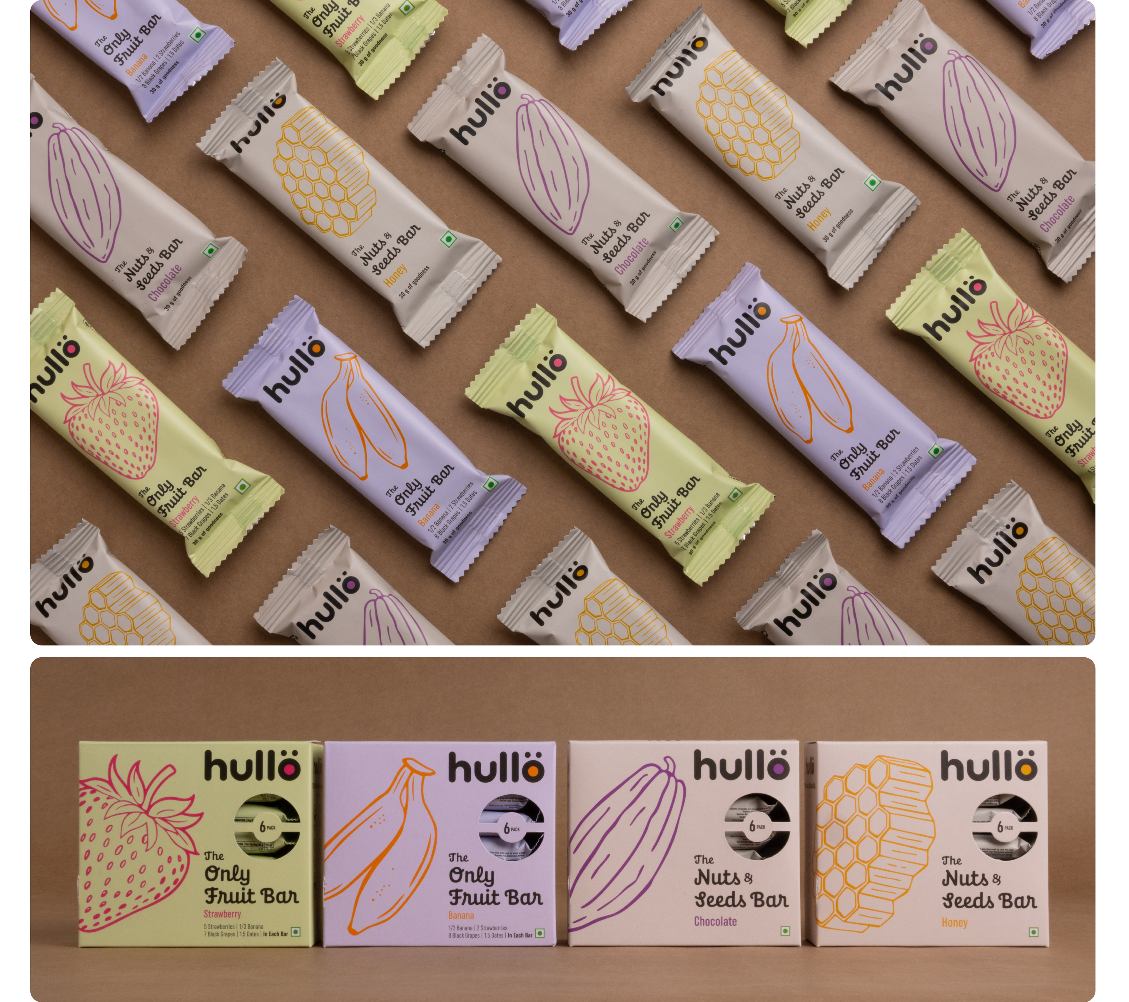
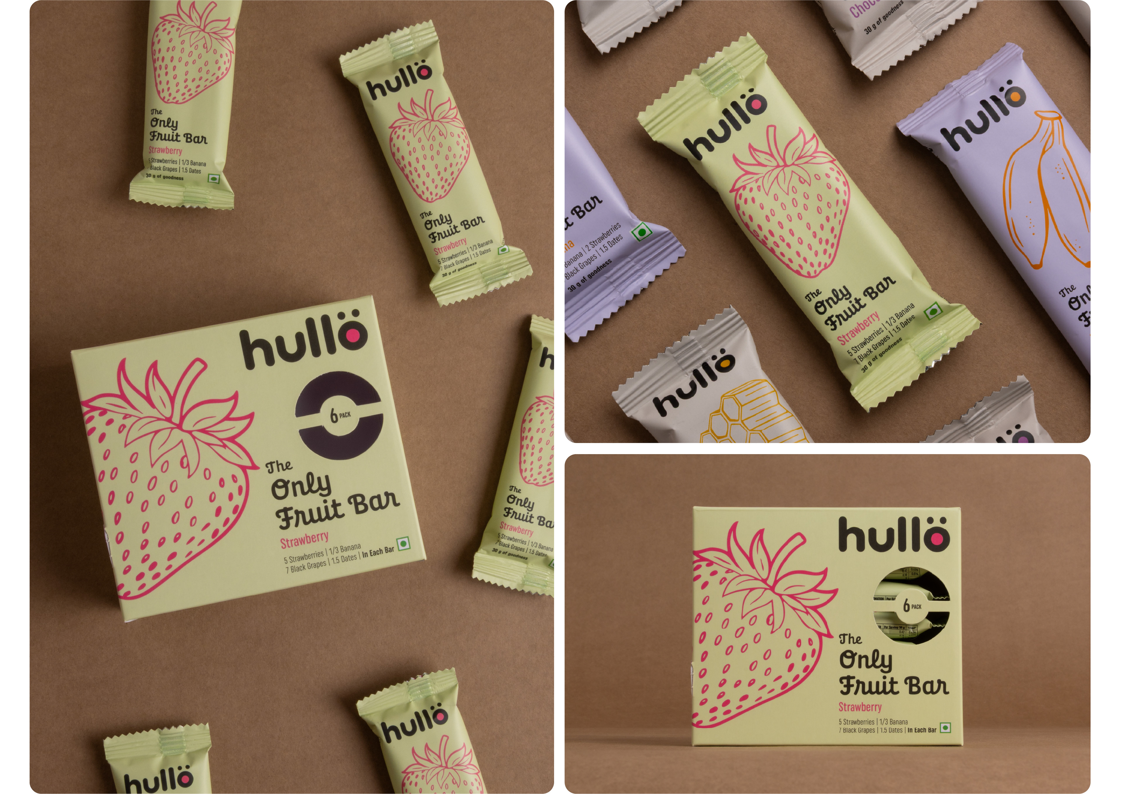
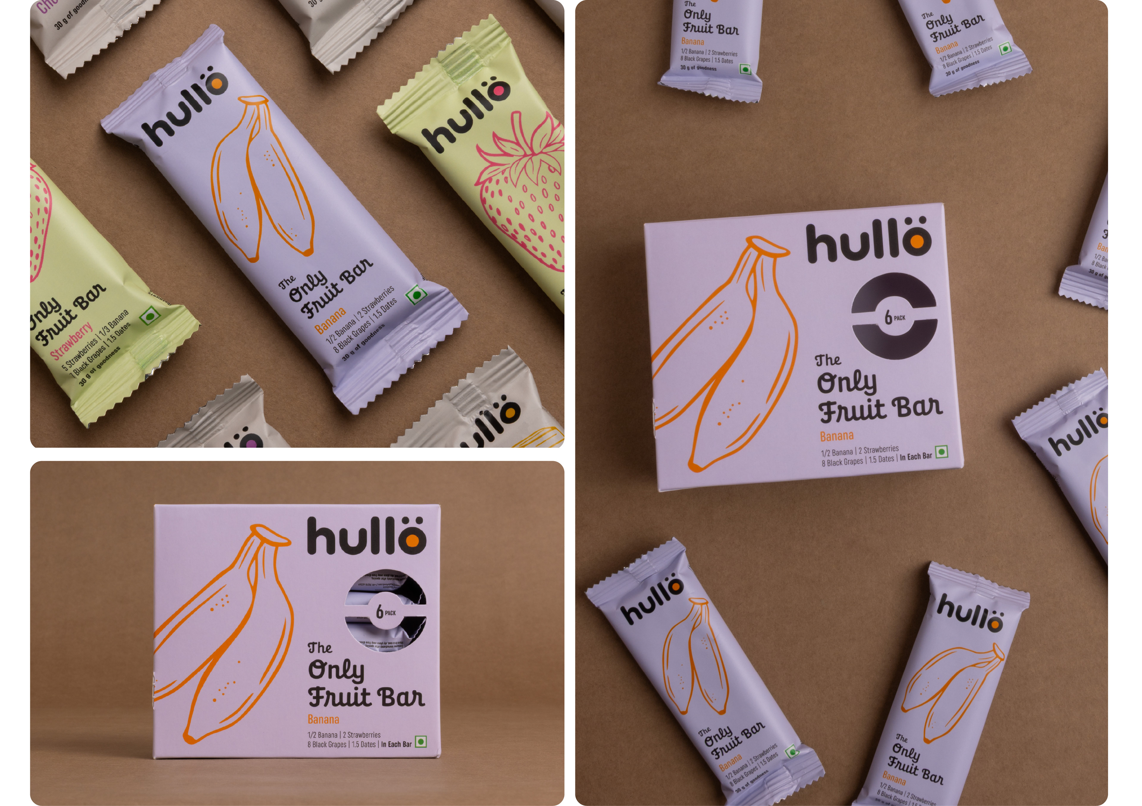
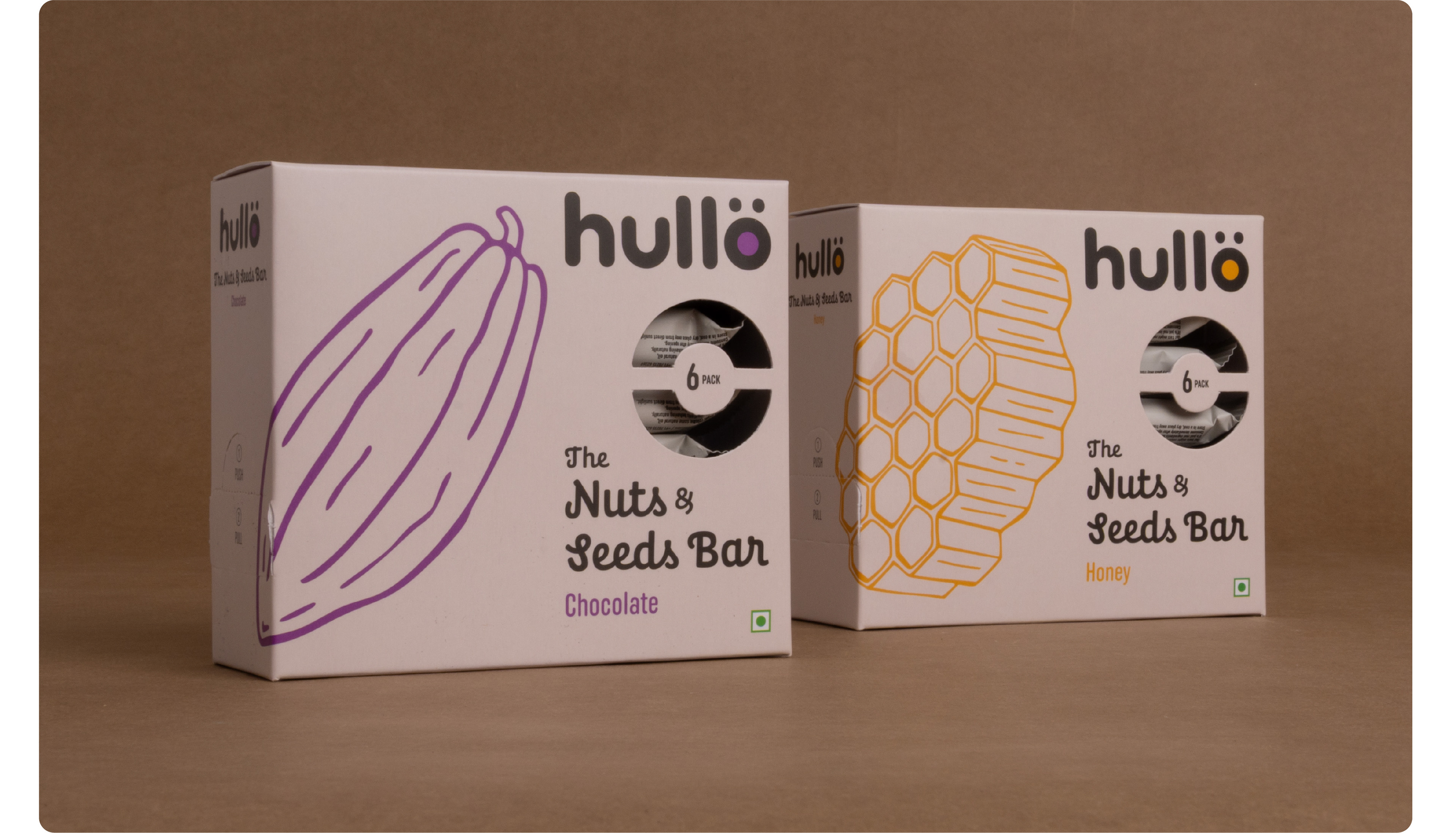
The packaging design is kept clean and minimal, reflecting the brand’s clean-label philosophy. An eye-catching line illustration and soothing colour blocks help identify each variant. The overall appeal is premium while remaining vibrant and approachable.
Hullo products are available on their website, hullofood.com, and in select stores across India.
View our projects and get in touch with us at impprintz.in
The name needed to be simple enough for children to remember and pronounce, yet appealing to adults. And so Hullo was born—fun and memorable for all. It’s a play on the word “hello”, a word used to greet, get attention, or express surprise; friendly, open, and universal in its appeal.
The identity was designed to resonate with a broad audience, from toddlers to adults. It has a clean, friendly, and modern feel, while staying neutral, bold, and wholesome. The letter “O” transforms into a wow emoticon, with two dots placed like eyes, adding an emotive quality to the logotype. The inside of the “O” can be filled with different colours based on its usage, giving the logo a playful, flexible, and dynamic character.
The packaging design is kept clean and minimal, reflecting the brand’s clean-label philosophy. An eye-catching line illustration and soothing colour blocks help identify each variant. The overall appeal is premium while remaining vibrant and approachable.
Hullo products are available on their website, hullofood.com, and in select stores across India.
View our projects and get in touch with us at impprintz.in