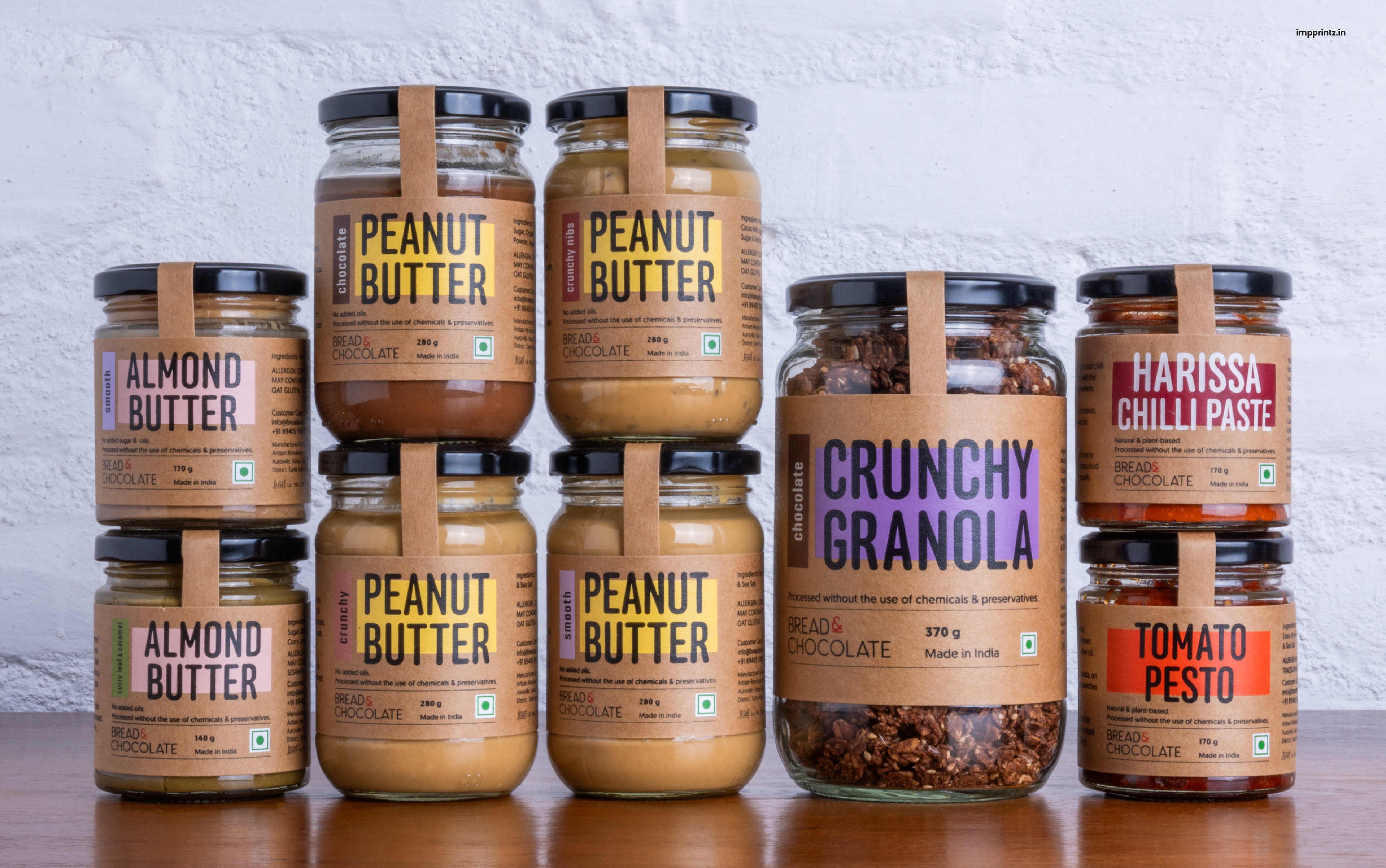
Bread & Chocolate is a brand born from a passion for artisanal, wholesome food made with the highest-quality, locally sourced ingredients. Committed to purity, their products are crafted without added oils, preservatives, or chemicals—embodying a philosophy of clean, conscious eating.
They approached us with a brief to refresh the packaging for their product range. The goal: to create a visual identity that feels modern, earthy, and vibrant while maintaining a simple, honest aesthetic that reflects their handcrafted approach.
Design Approach
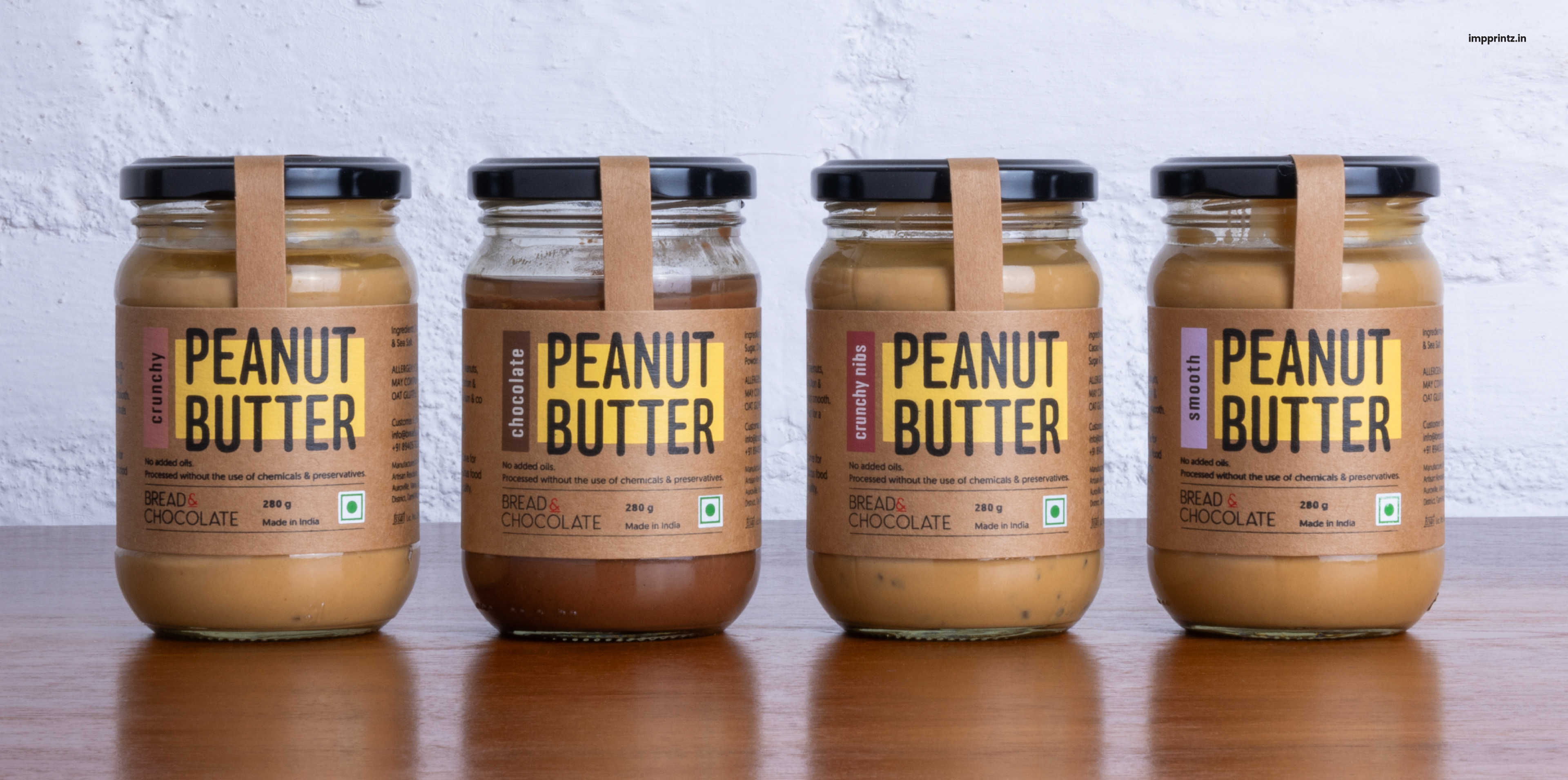
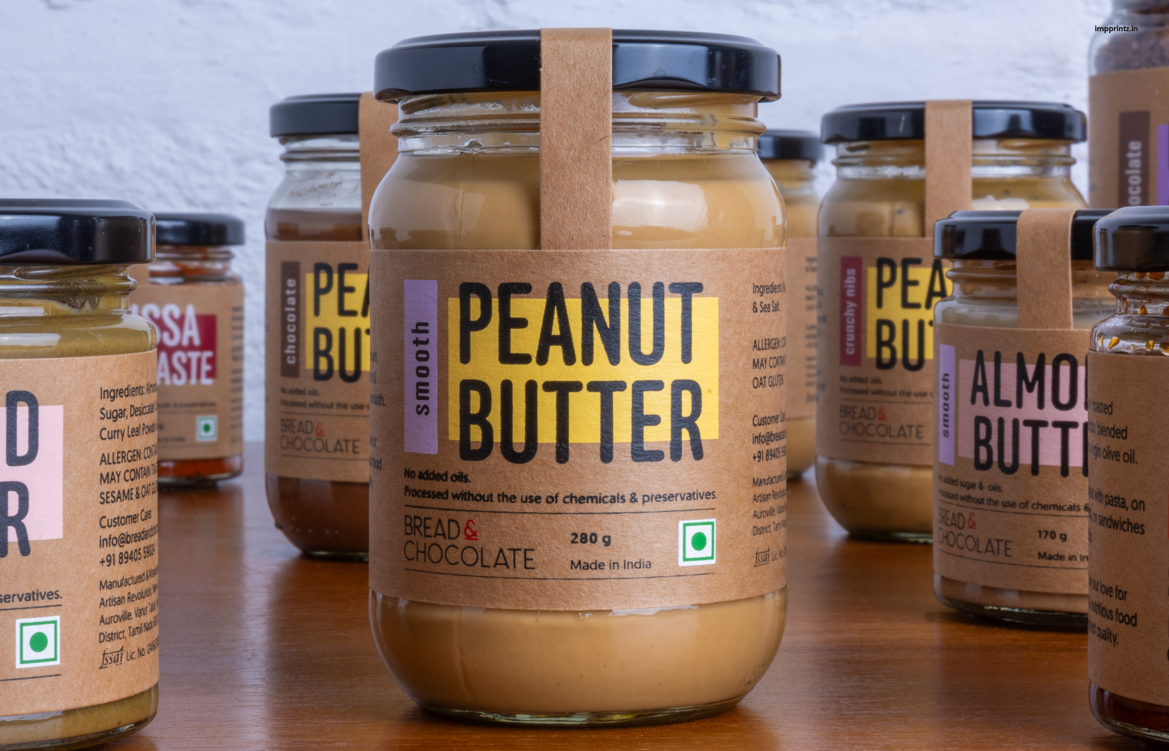
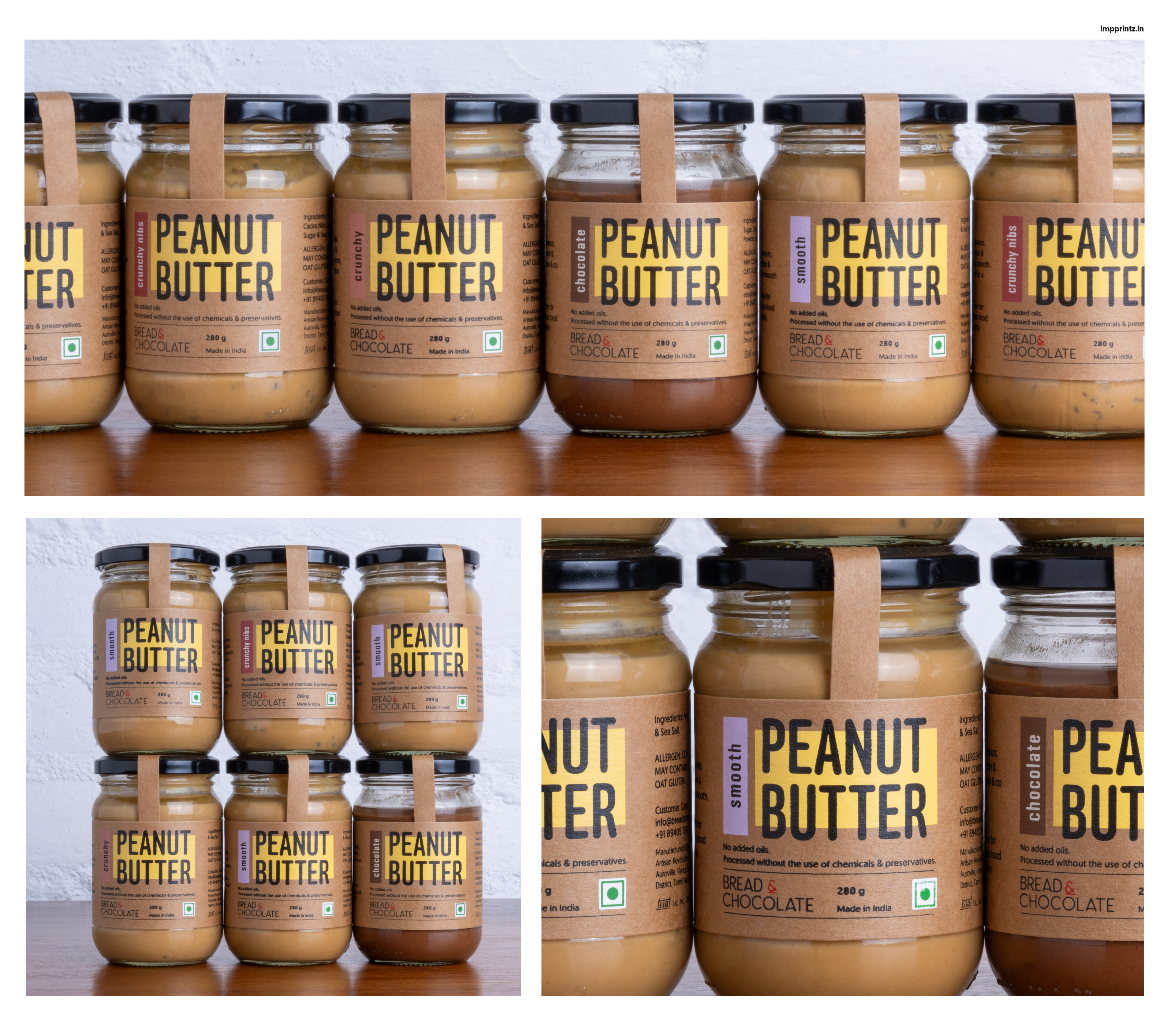
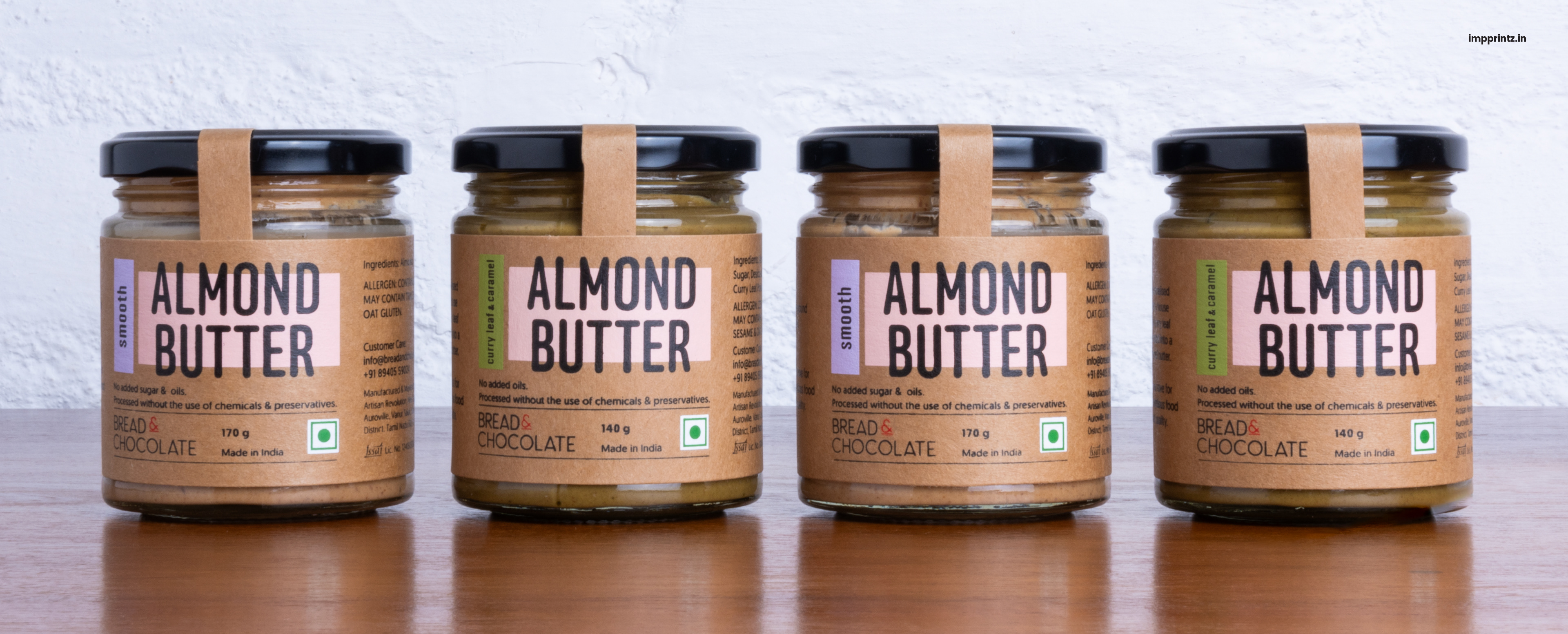
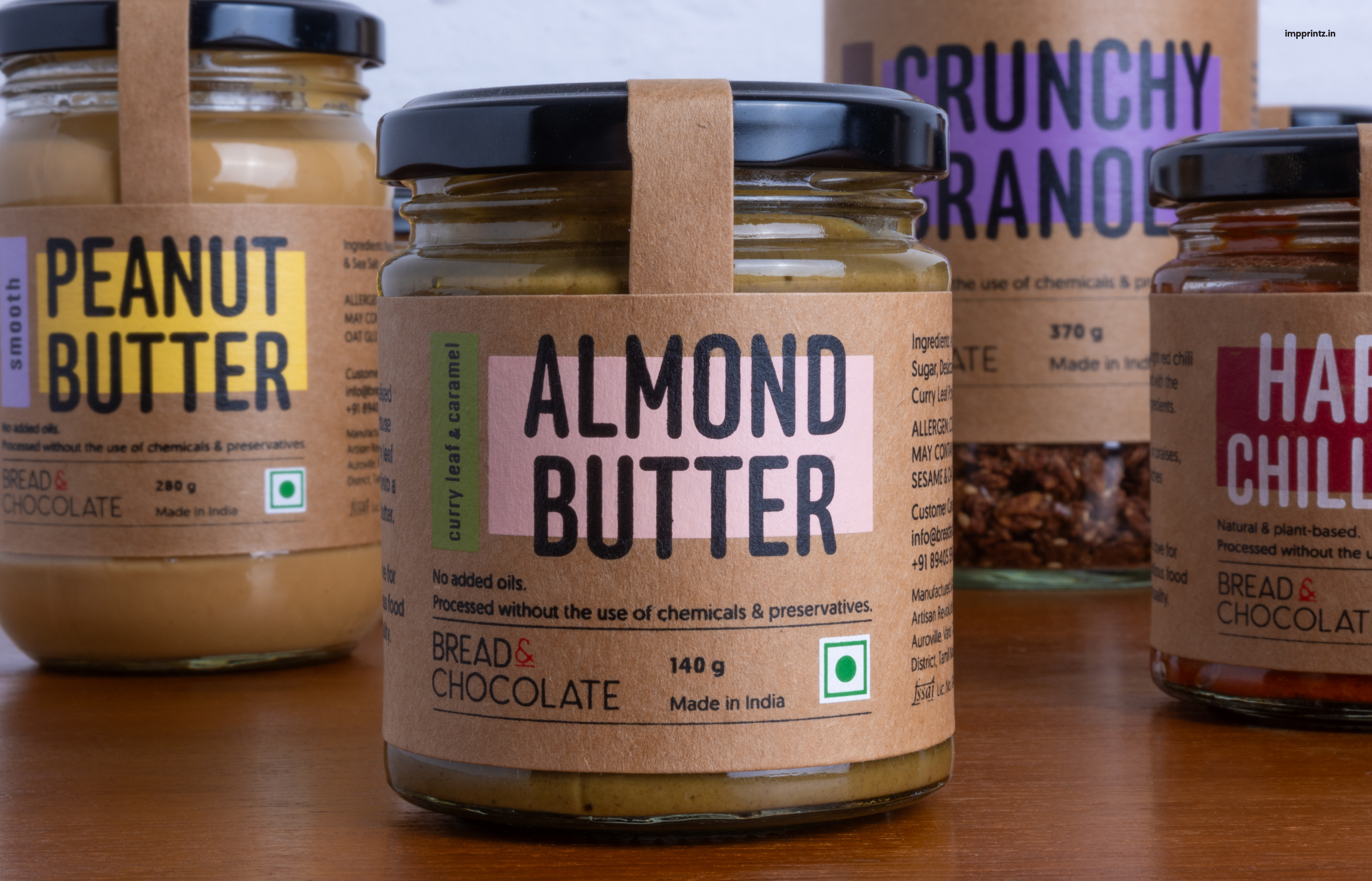
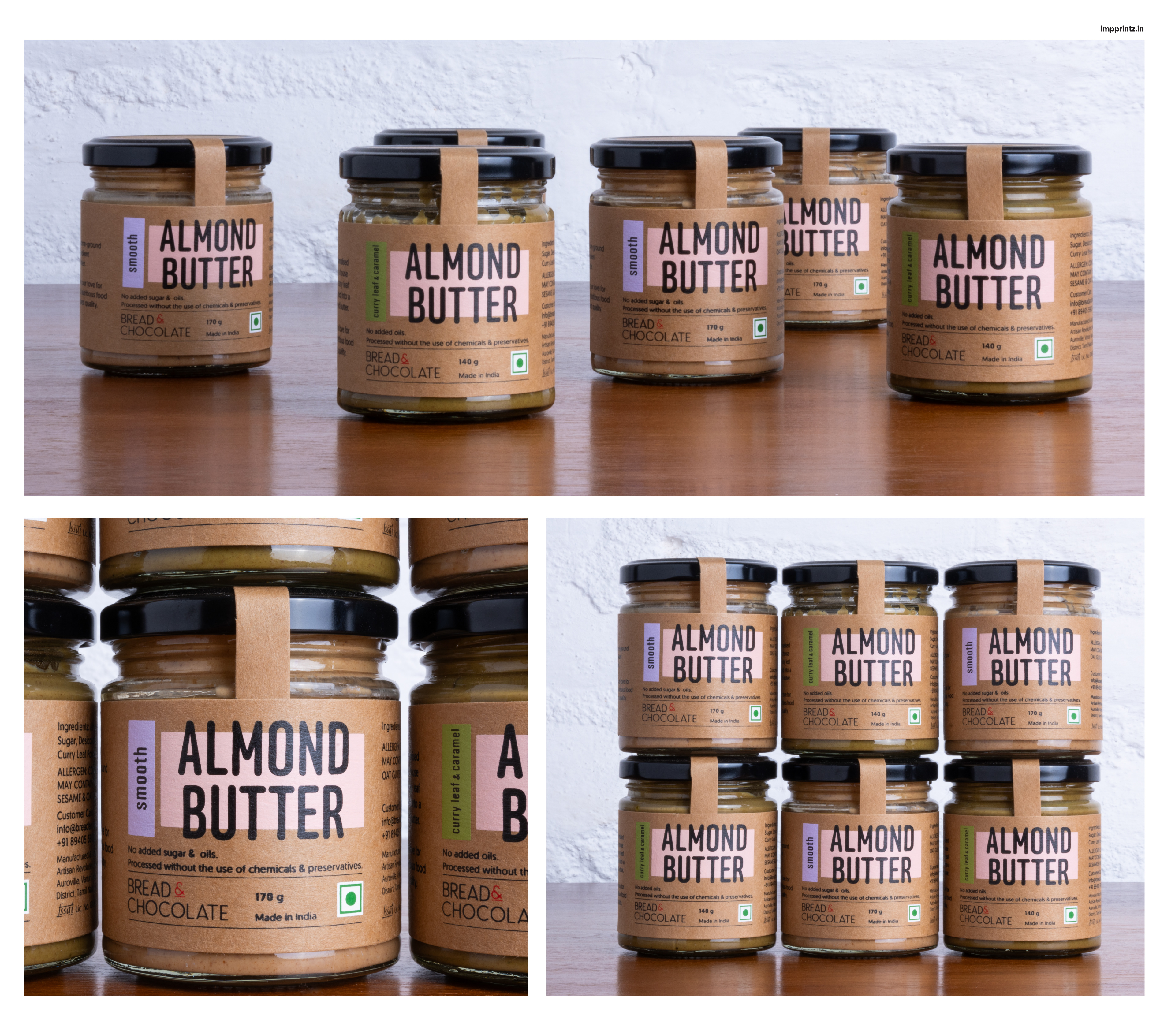
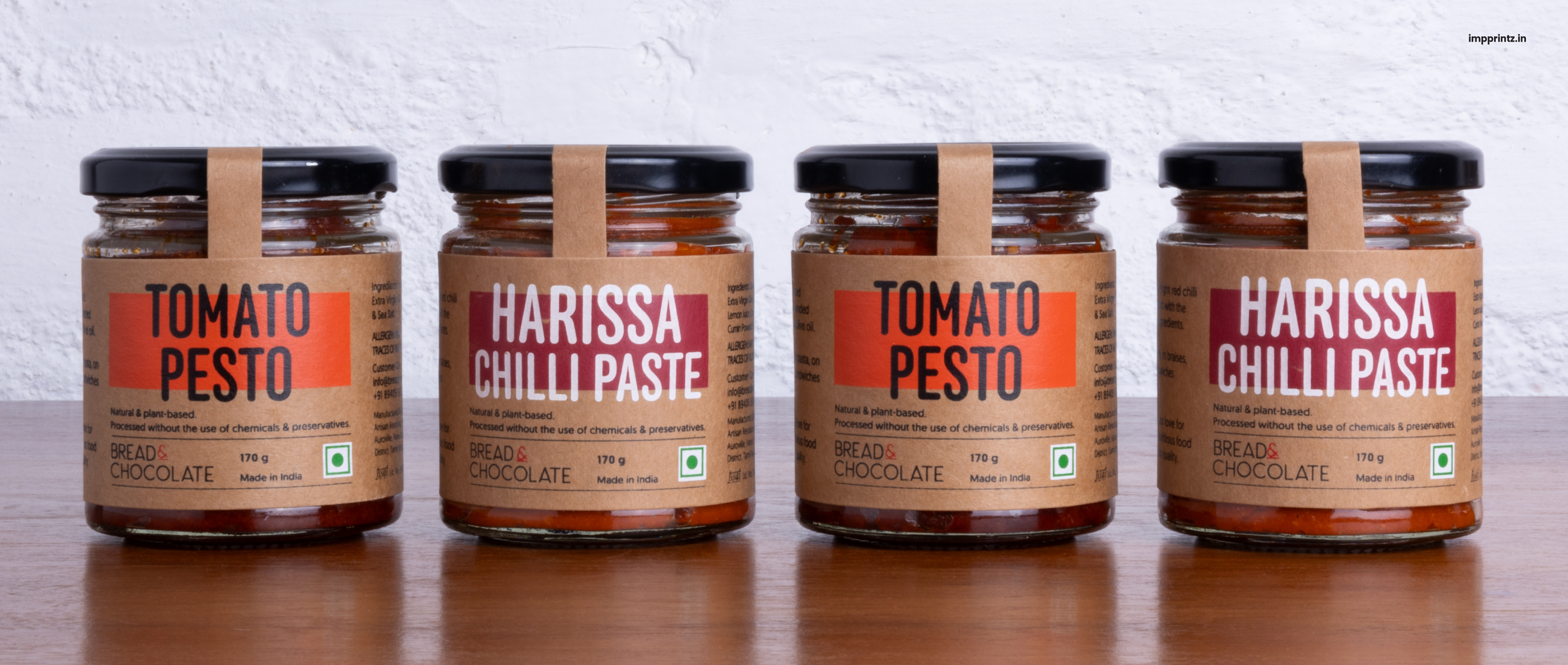
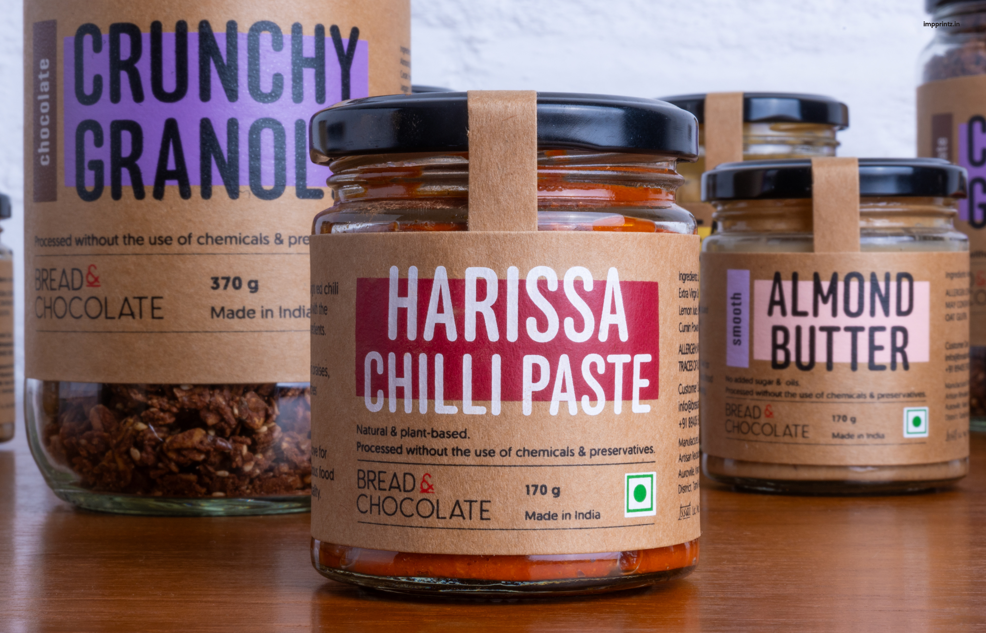
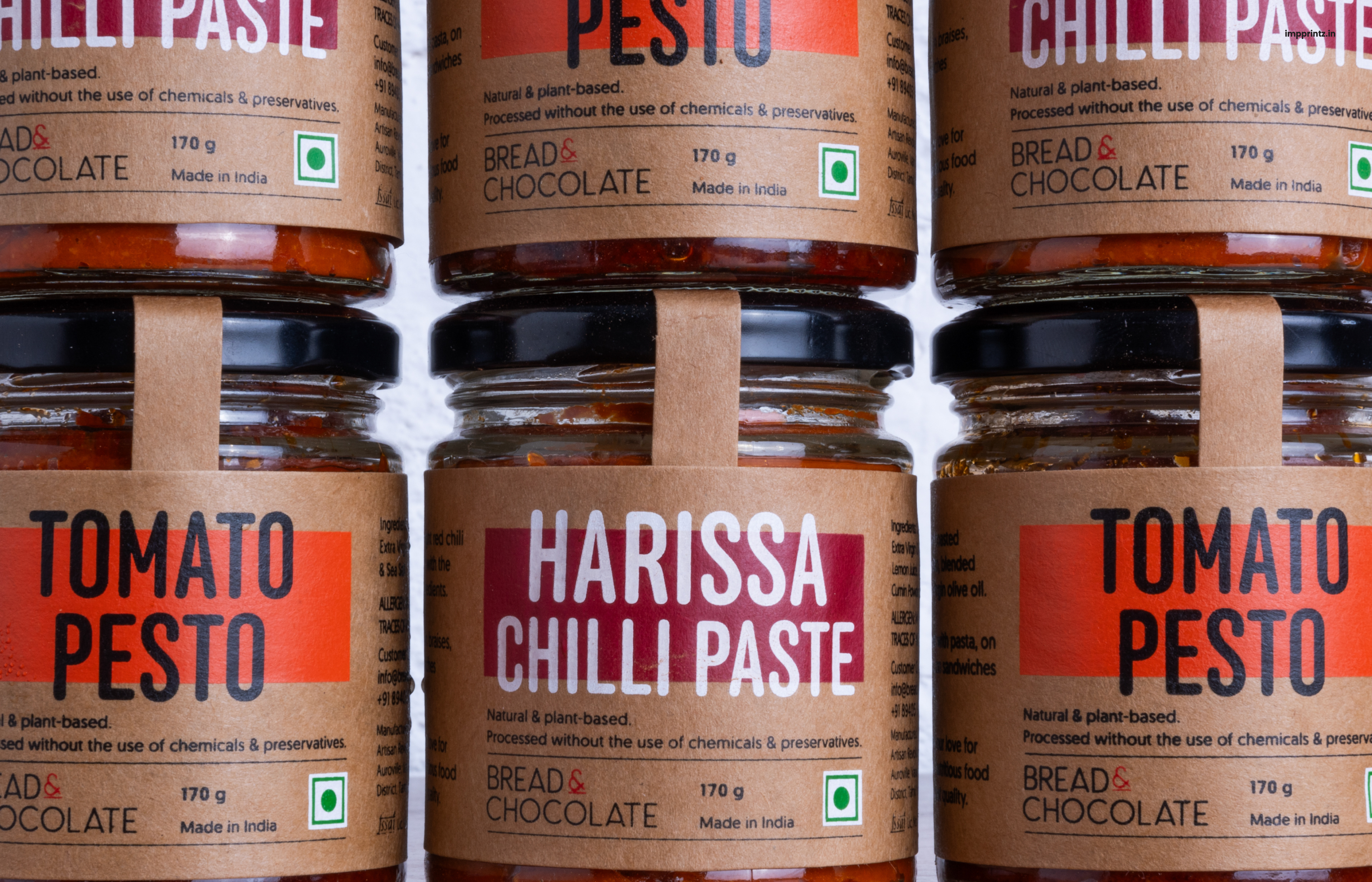
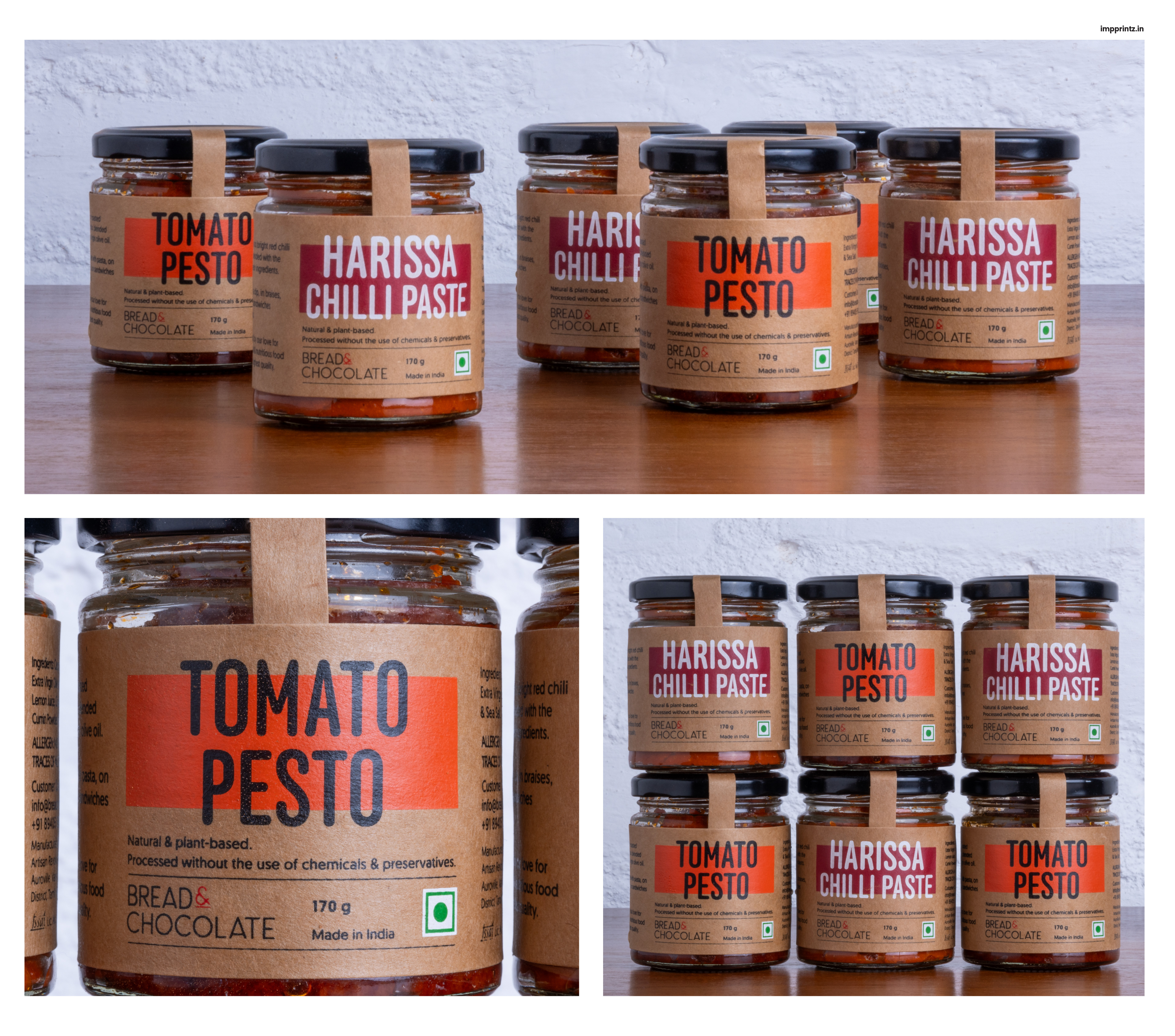
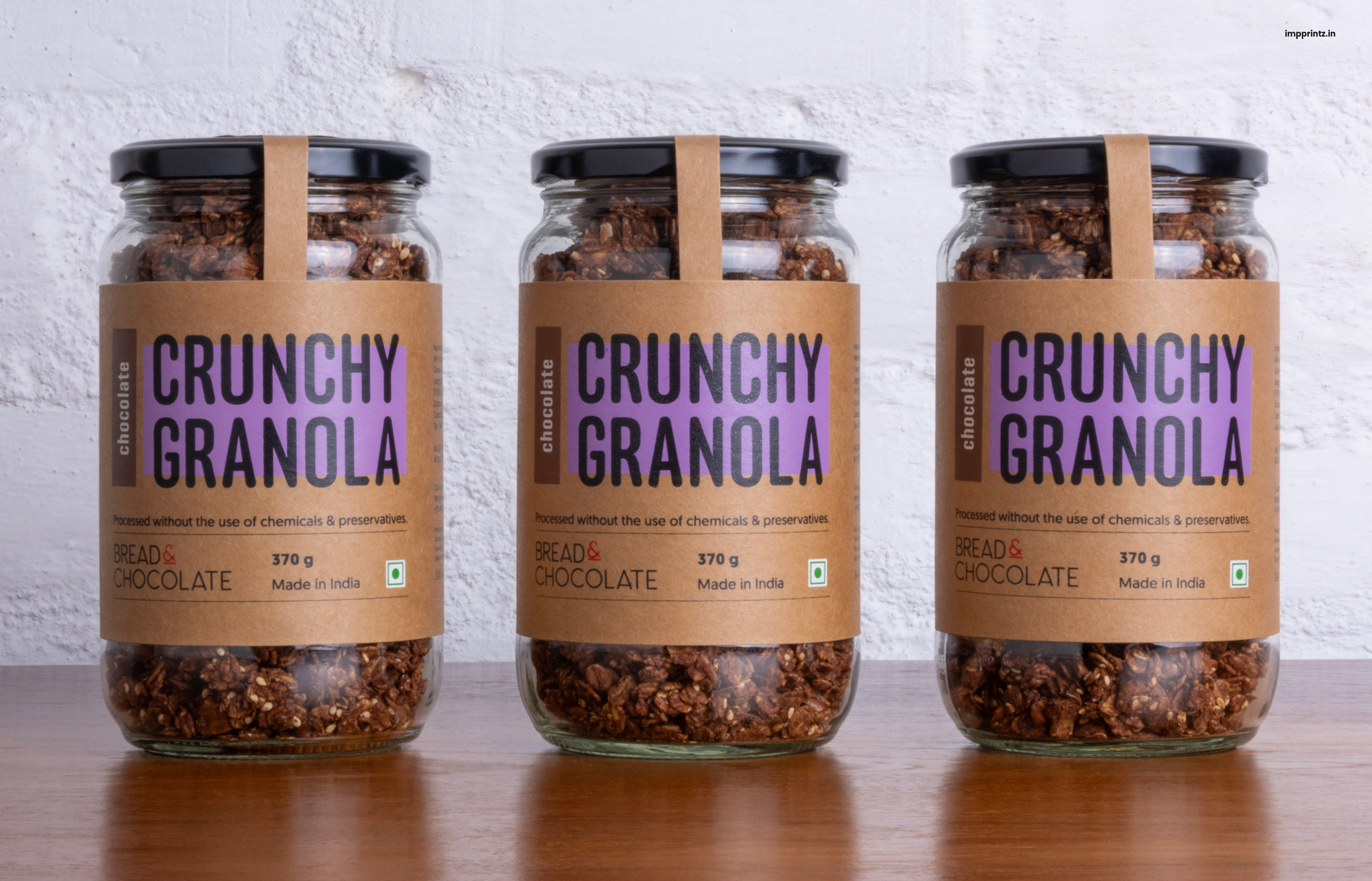
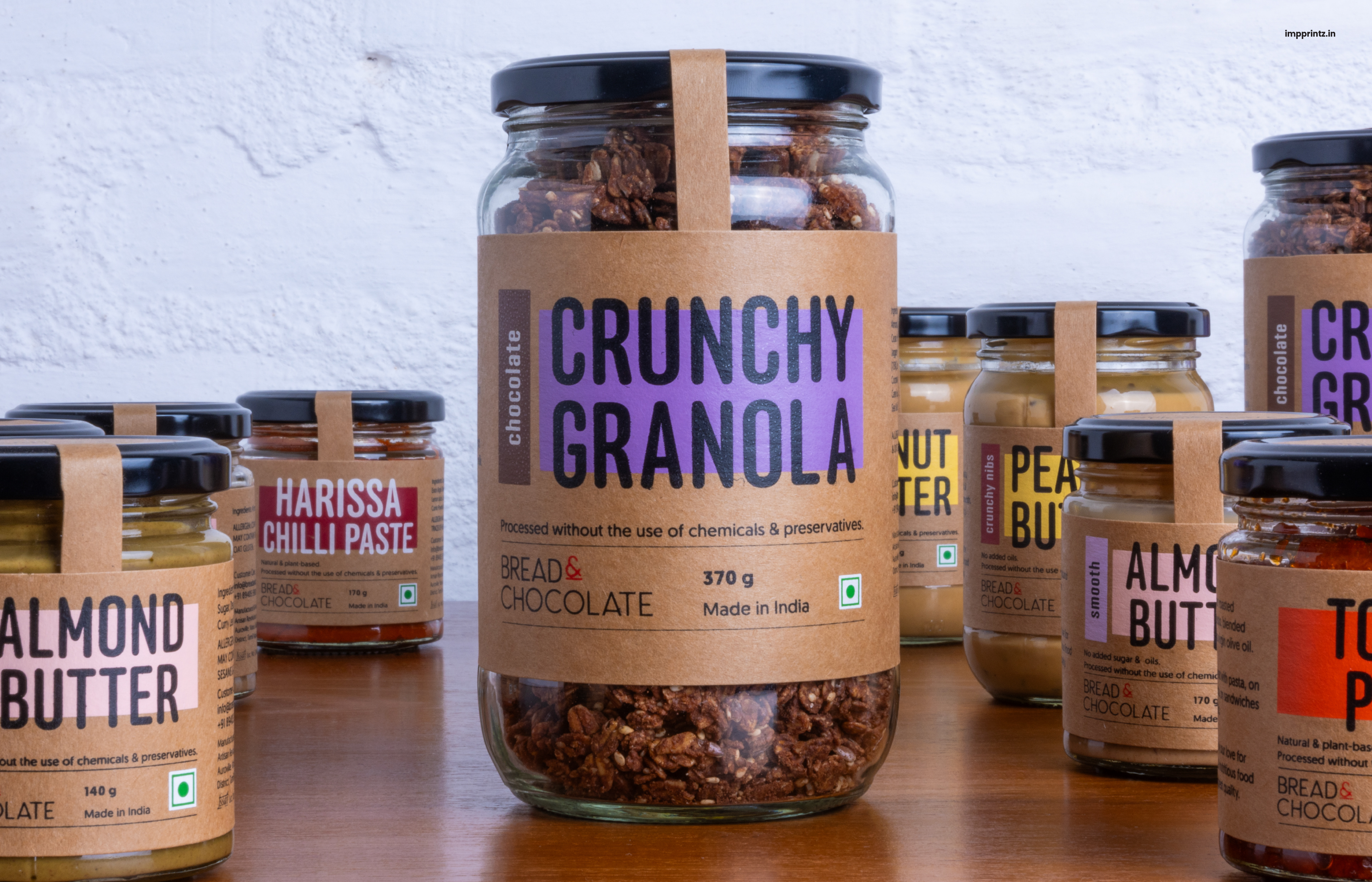
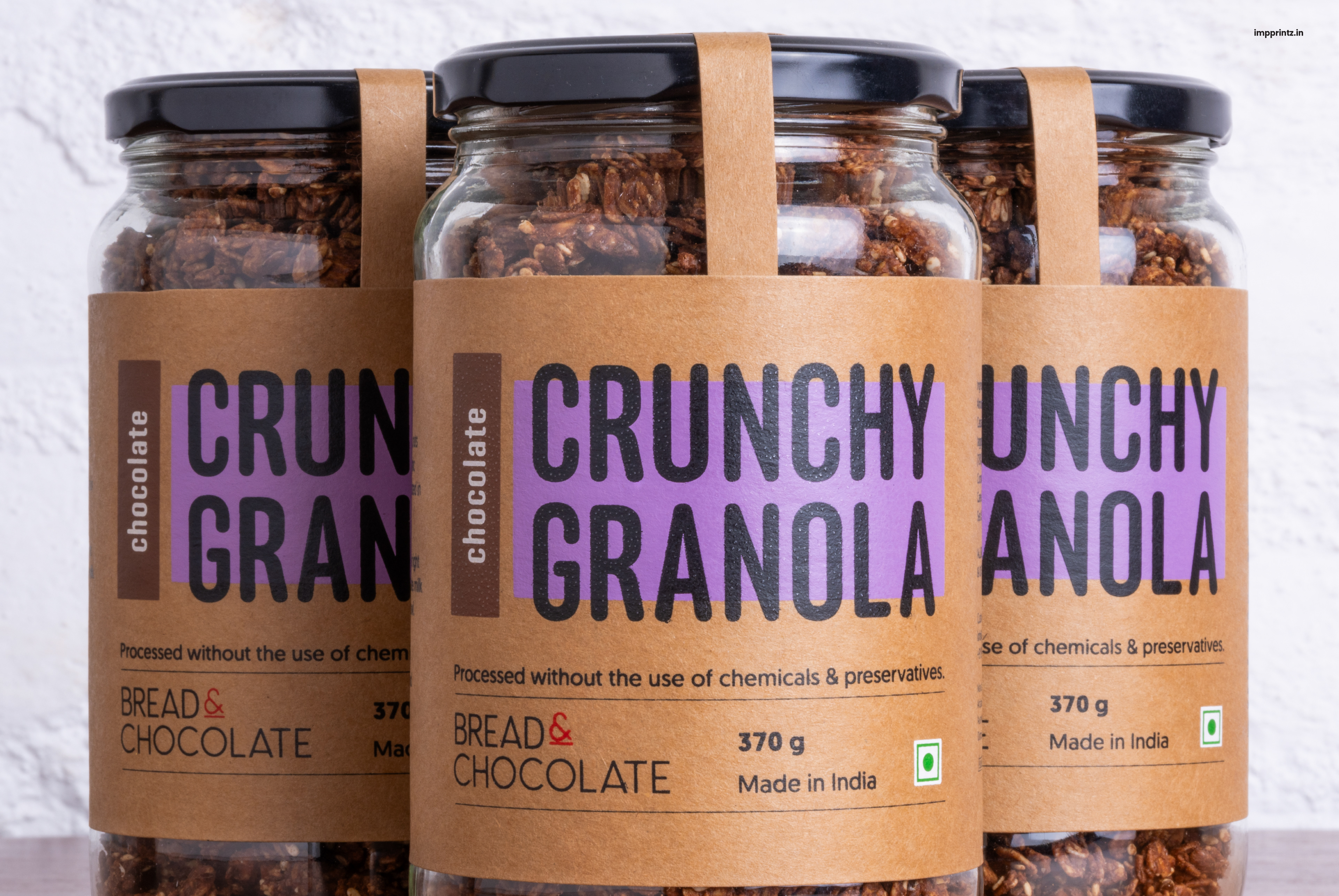
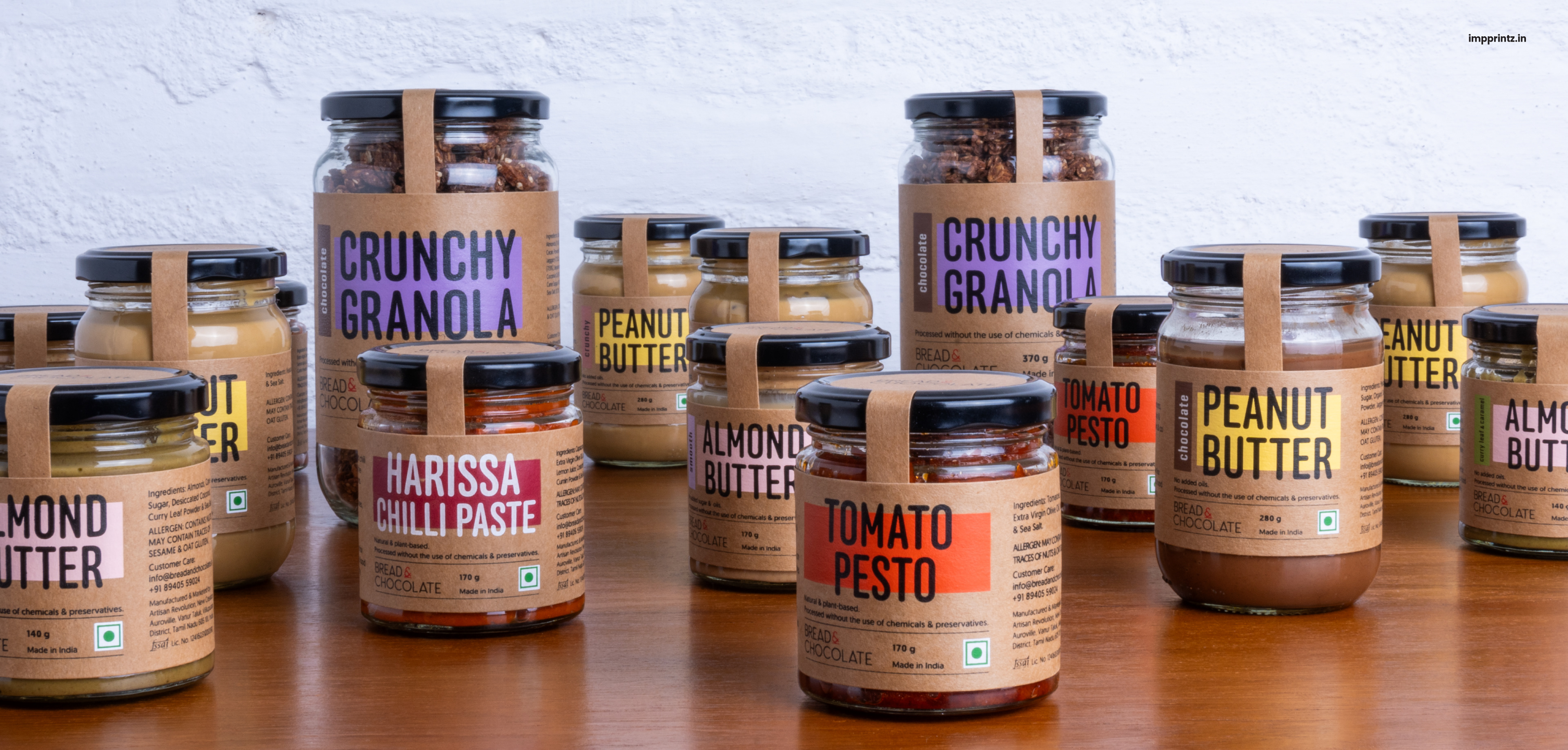
The packaging refresh was guided by two key principles: functionality and form. With compact label sizes, especially for their jars of nut butters and pastes, visibility and clarity on shelves were essential. Typography took center stage in the design system. The product names are set in a condensed, bold typeface—crafted specifically for tight spaces. The font carries a balance of informality and seriousness, reflecting the brand's wholesome yet elevated feel. Bold titles stretch beyond their background blocks, creating a feeling of abundance and approachability.
Colour System
To ensure the variety of products could be quickly and clearly identified, we developed a strong, intuitive colour-coding system. Each product category is represented by a primary colour, while each variant within the category is assigned a secondary highlight. The palette is vibrant yet soft—appetising without being overpowering.
A signature design element—a bold, offset rectangular smear of the category colour—sits behind the product name, with a touch of the variant’s highlight colour on the left edge. This creates a layered, crafted look that feels both dynamic and grounded.
Material & Production
Staying true to the brand’s artisanal ethos, all packaging is screen printed on kraft paper. This not only lends a tactile, handmade feel but also reinforces the brand’s commitment to sustainability and natural materials.
Rollout
This refreshed visual identity has been applied across Bread & Chocolate’s range of Nut Butters, Pastes, and Granola. The new packaging is now available at their stores and cafes—inviting customers to engage with the brand through a visual language that is as thoughtful and crafted as the food itself.
IG @breadandchocolate_india