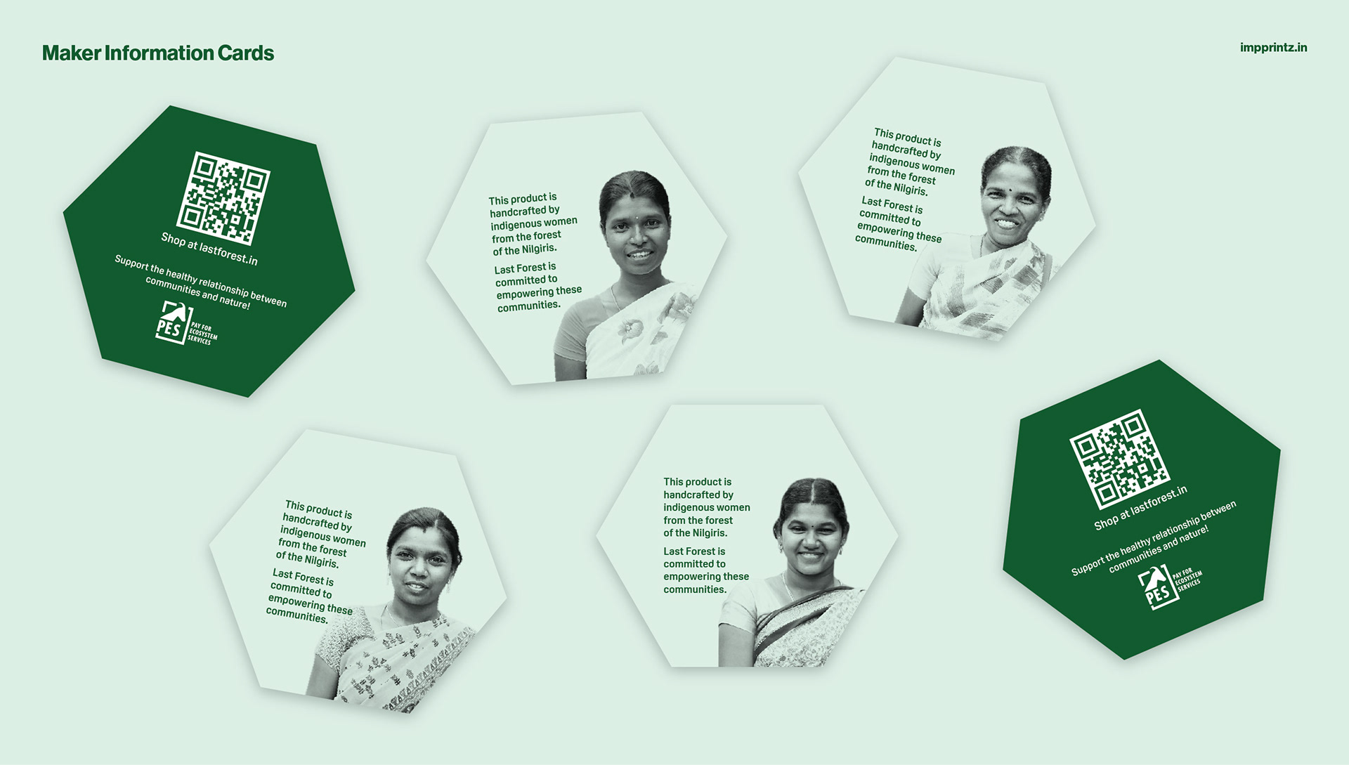
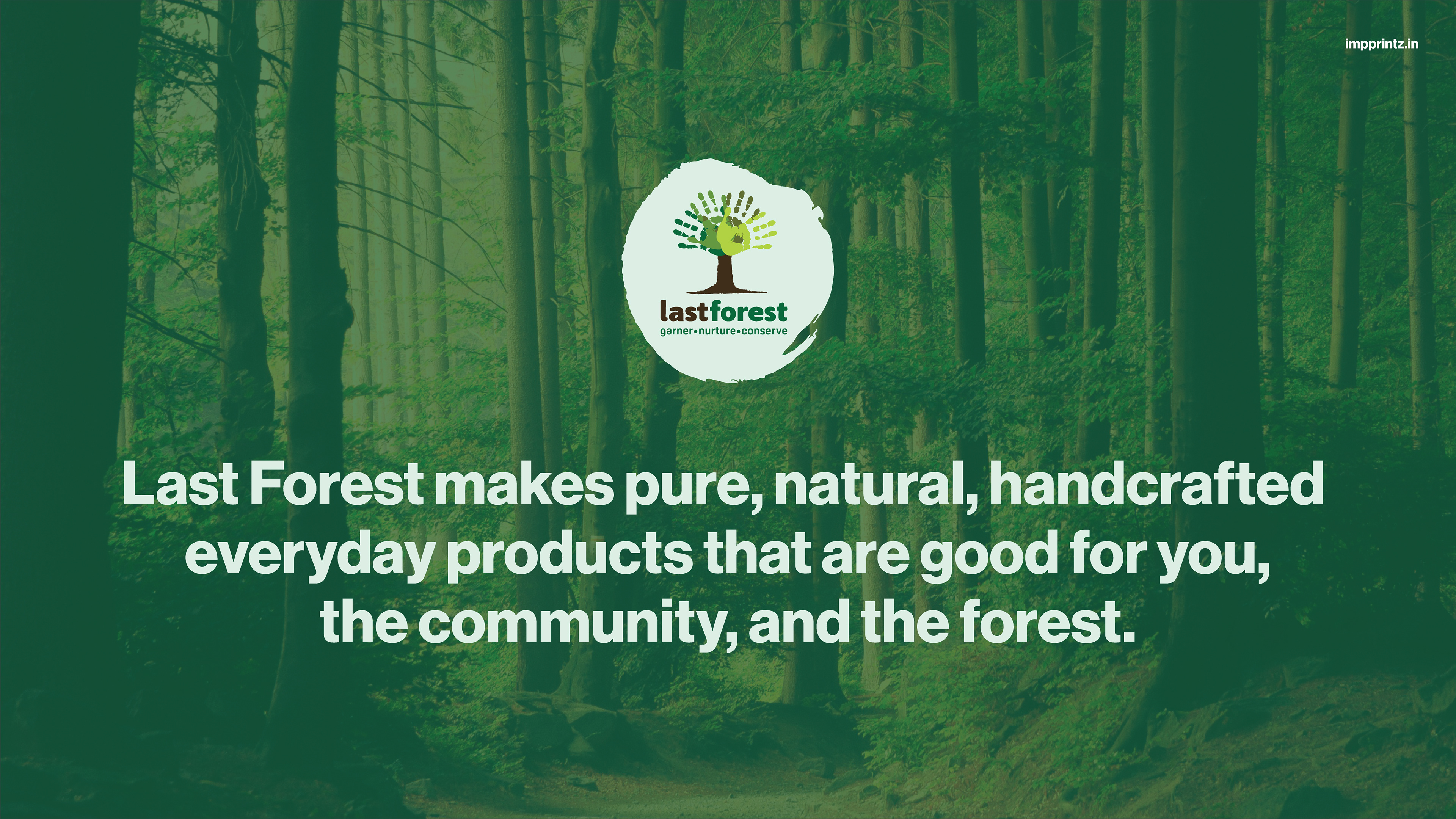
Based in Kotagiri in the heart of the Nilgiri mountains, Last Forest Enterprise has been a market intermediary for wild forest produce that is harvested by indigenous communities since 2010. These communities are working on forest and agriculture produce, which are natural, wild and local. They cater to the entire supply chain of procurement, quality check, brand, promote and sell organic, fair trade, and indigenous products.
Last Forest approached us when they were ready to take the brand to wider audiences across India and abroad. Having great products and a powerful story, we had to capture the essence of this, so that it could be applied across their communication.
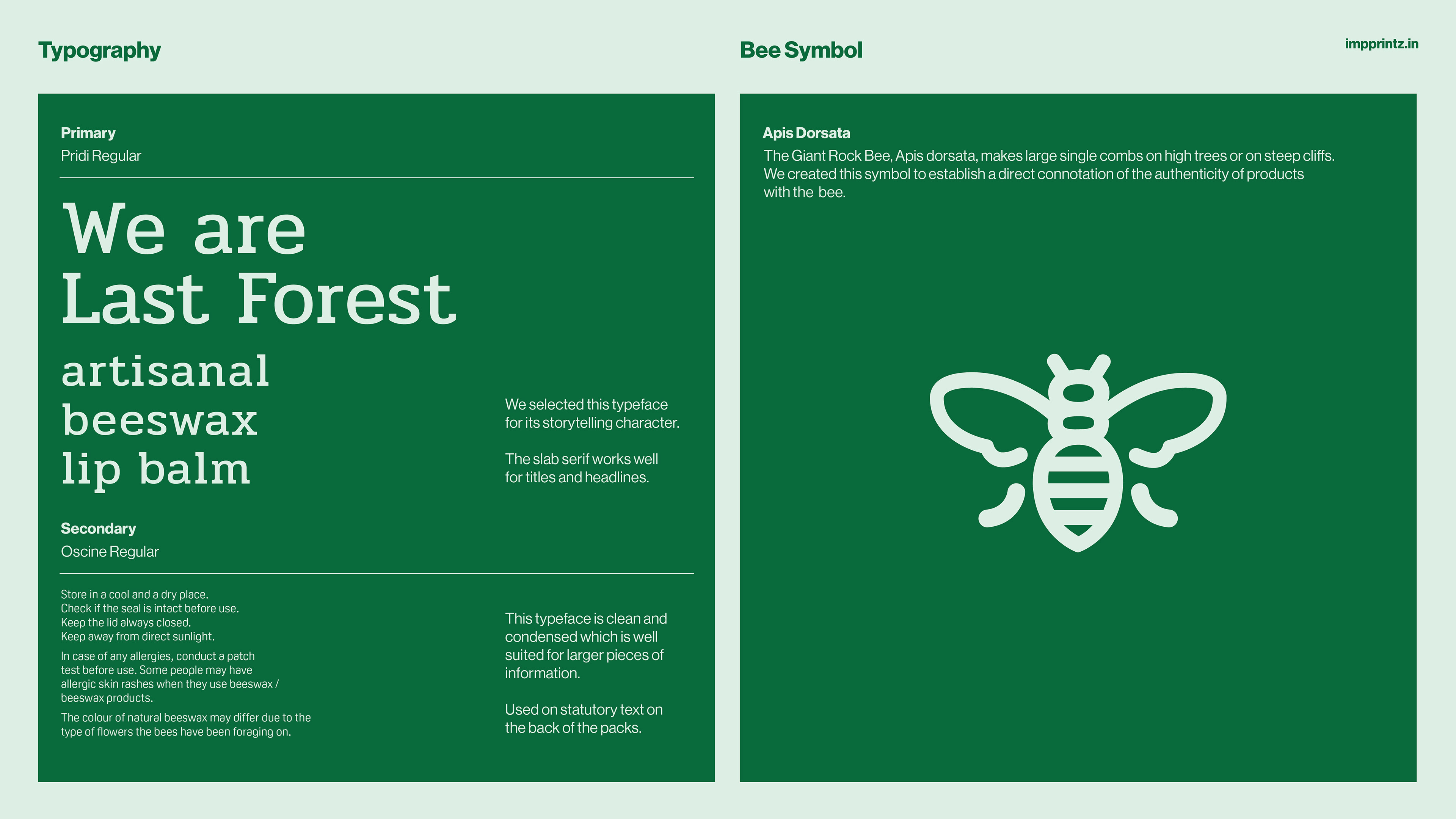
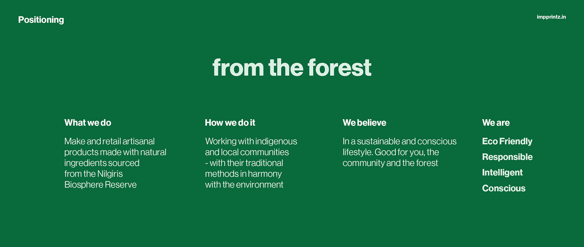
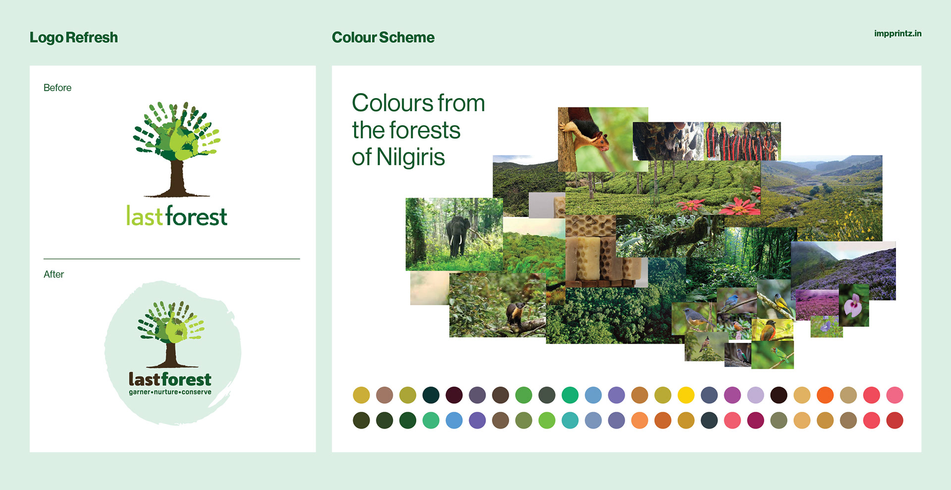
We started with refining their logo, strengthening it while keeping the essence of the original design, understanding its functionality across applications while articulating the positioning for the the brand and its products.
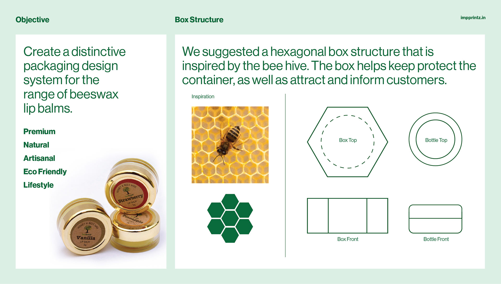
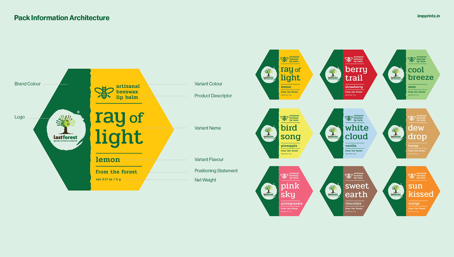
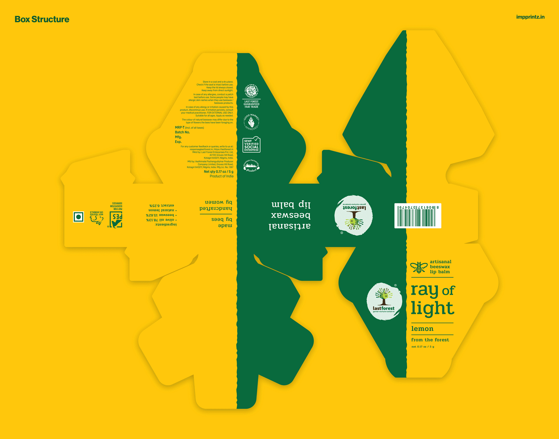
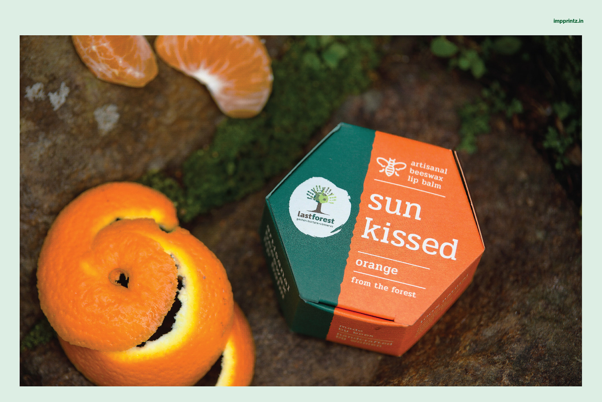
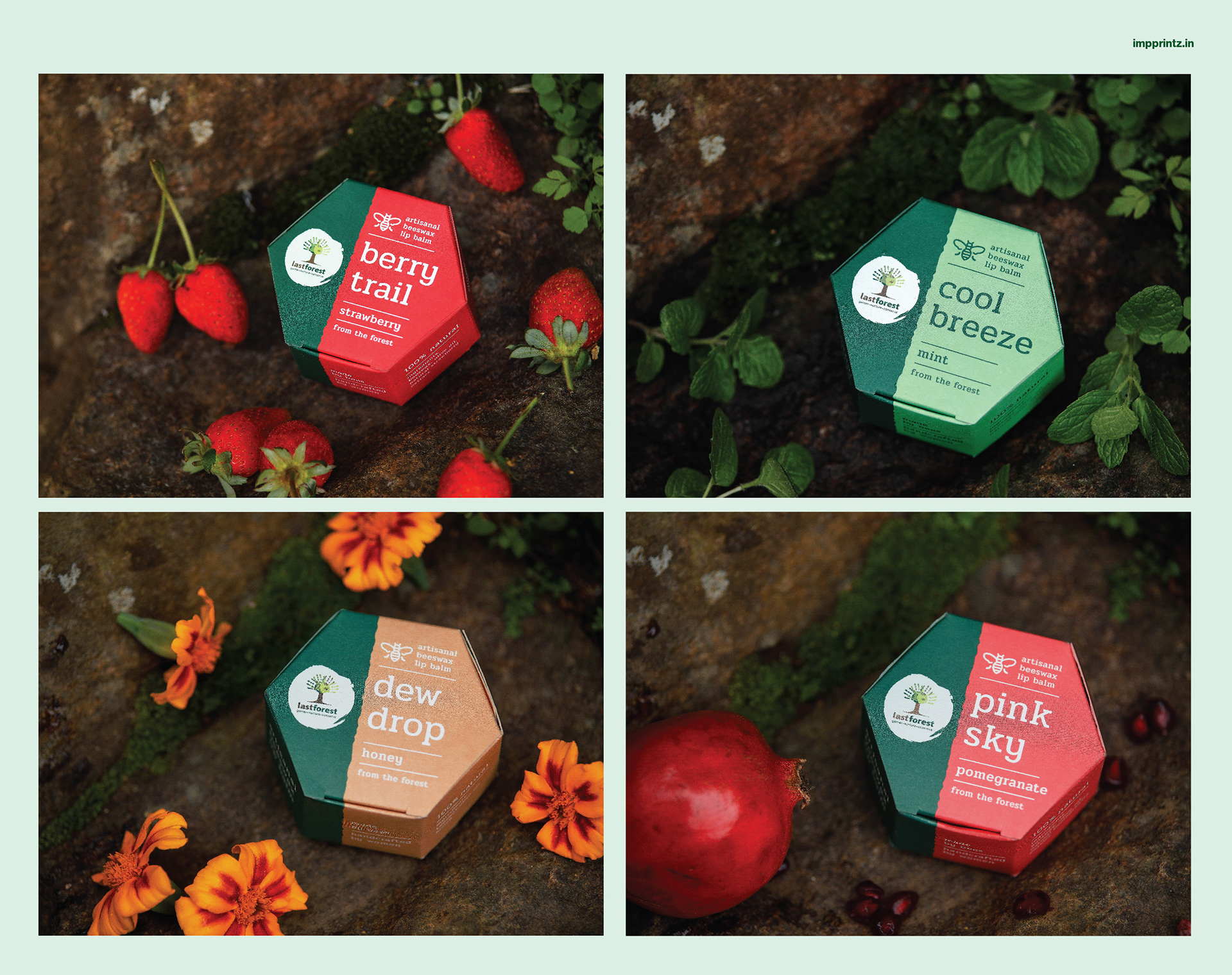
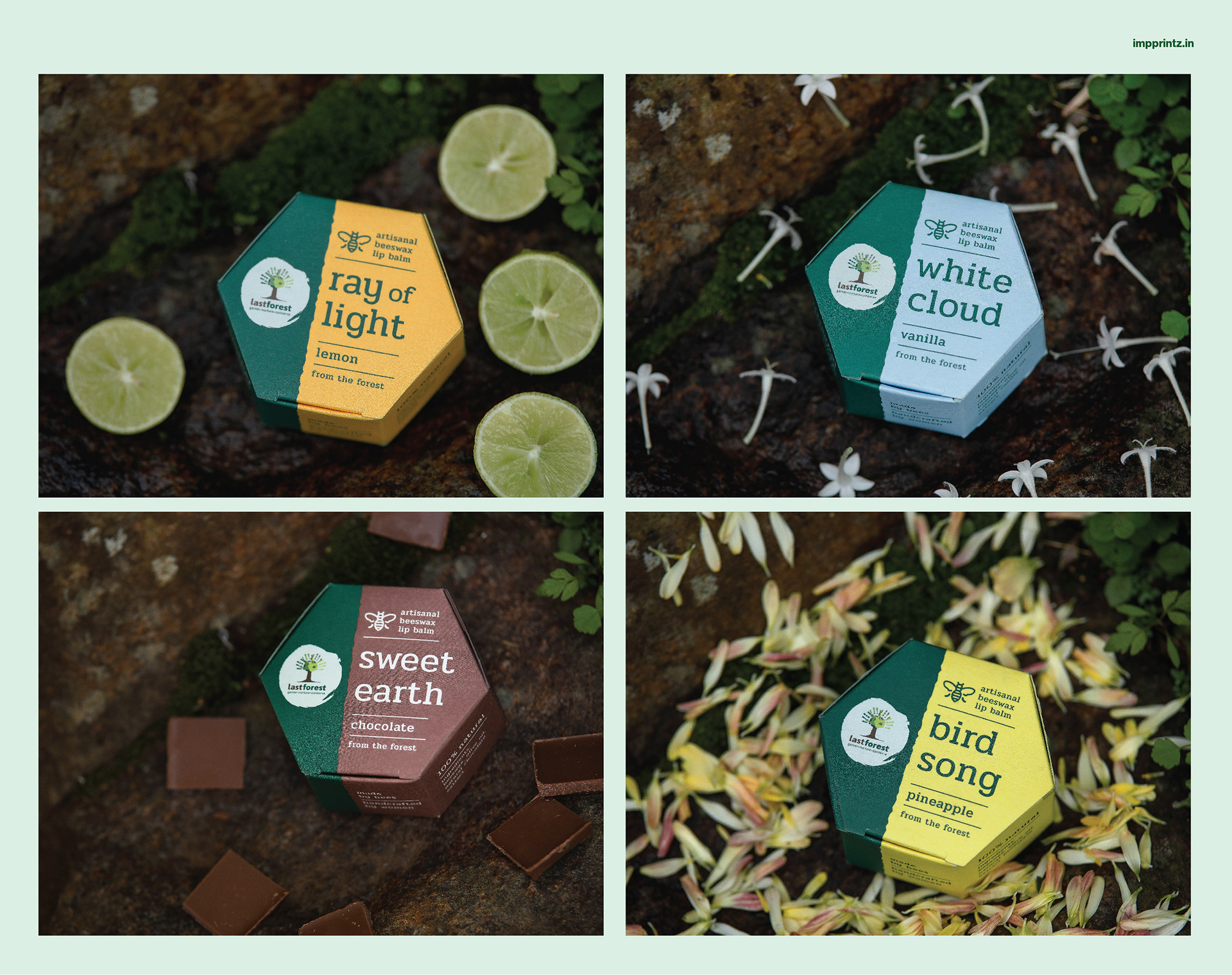
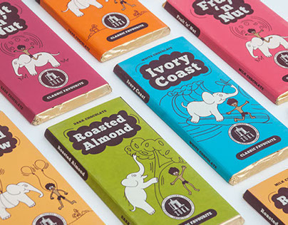
This was followed by the packaging design system for the range of artisanal beeswax lip balms. The nomenclature was inspired by the defined positioning - 'from the forest'.
Nomenclature story:
Let’s take a walk in the forest together ...
Let’s take a walk in the forest together ...
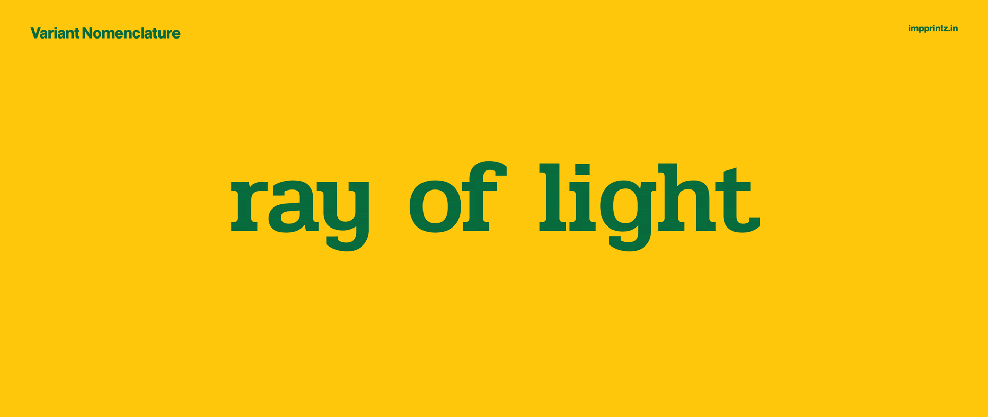
Think of ‘Lemon’. A bright burst of yellow. Like a ray of light rushing down through treetops.
Think of ‘Strawberry’. Bright pops of red. Like fresh, juicy berries on a berry trail.
Think of ‘Mint’. Reviving all the senses. Like a refreshing cool breeze blowing upon you.
Think of ‘Pineapple’. Its lingering sweet notes. Like the melody of a birdsong close by.
Think of ‘Vanilla’. A flower, dainty and pale. Like a white cloud hanging in the sky.
Think of ‘Honey’. This luscious, glistening nectar. Like dew drops of liquid gold.
Think of ‘Pomegranate’. Staining lips with rosy hues. Like a pink sky painted by the sunset.
Think of ‘Chocolate’. Warm, delightful and comforting. Like walking barefoot on the sweet earth.
Think of ‘Orange’. A burning wish. Like flowers reaching out to be sun-kissed.
Photo credits: Last Forest
"We started working with Impprintz in 2019, and they have completely changed the way our brand, Last Forest communicates with the customer. It started with our logo itself being tweaked so that it is a more contemporary expression of ourselves. And ever since then, we have moved from one product category to another... it has been a great journey.
At every step, they have forced us to relook at ourselves, our product and what story we want told. The strong colours and sense of aesthetics they have brought has made us stand out on every shelf that we sit.
Today, we have an identity that is beautiful and strong - it combines the sense of the forest and the spirit that it evokes."
Mathew
Managing Director, Last Forest
Managing Director, Last Forest